Role: Sole Designer
Duration: 2 months
Skills: Figma, User Testing, User Interviews, User Surveys
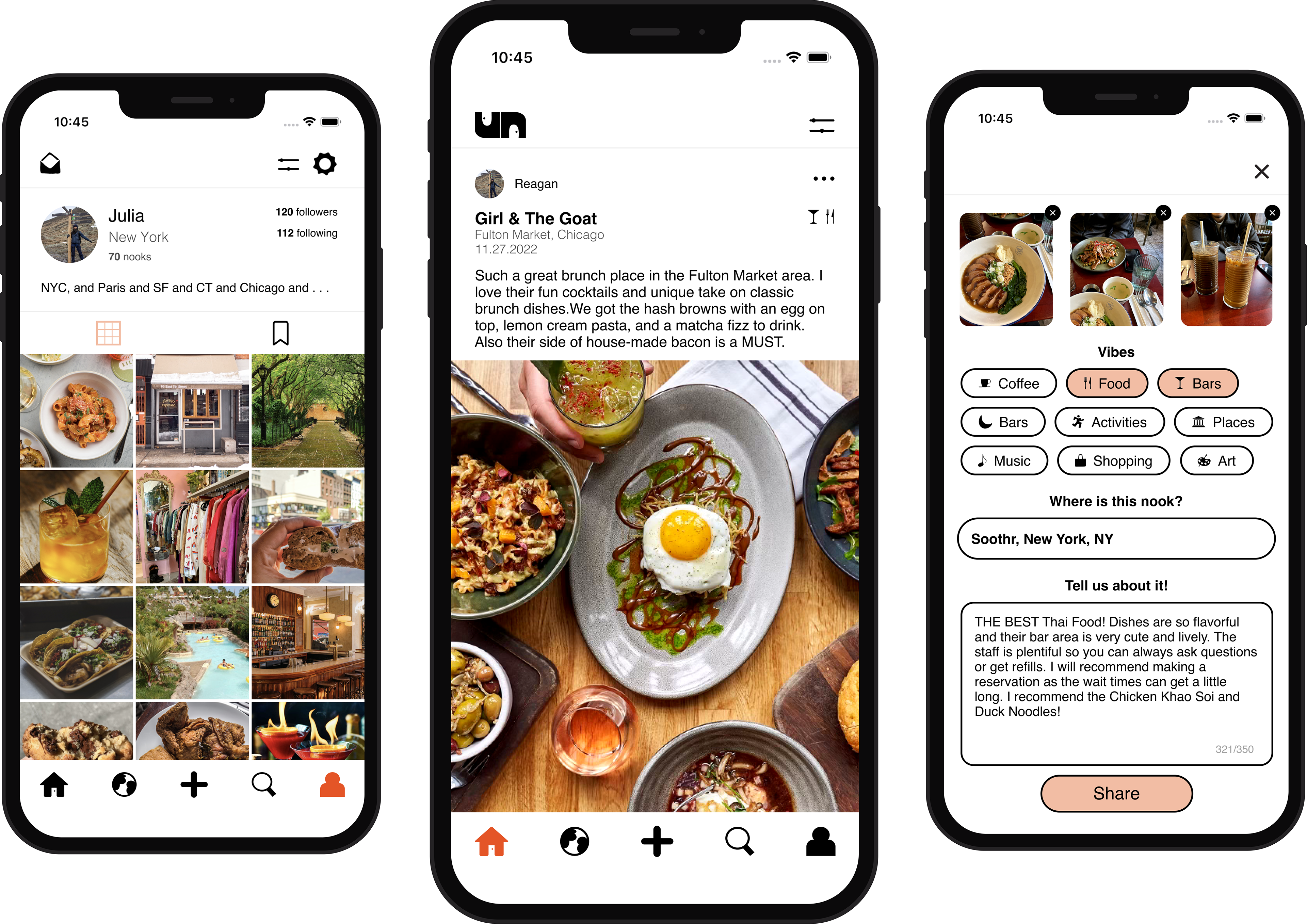
Final Designs
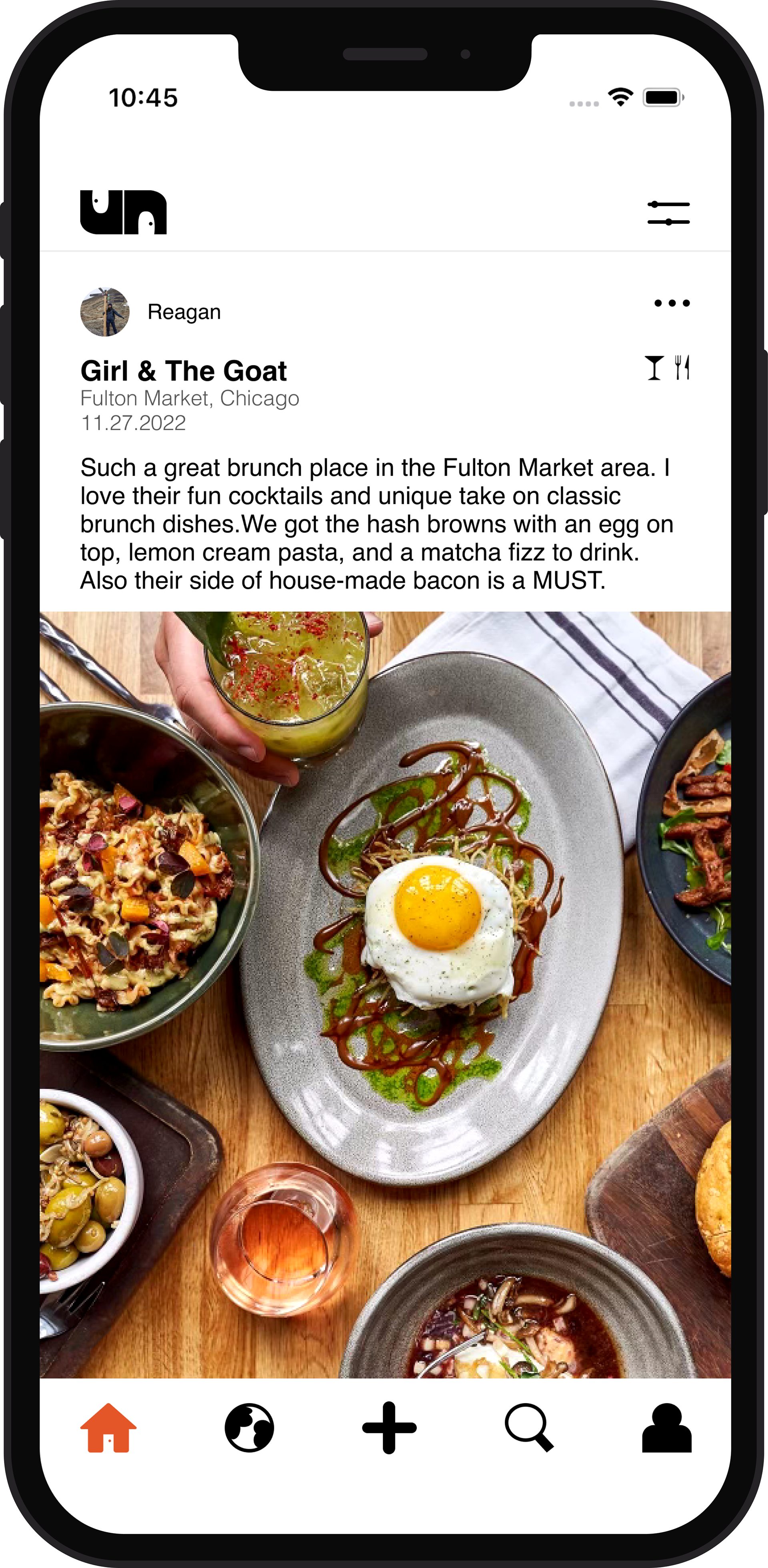
home
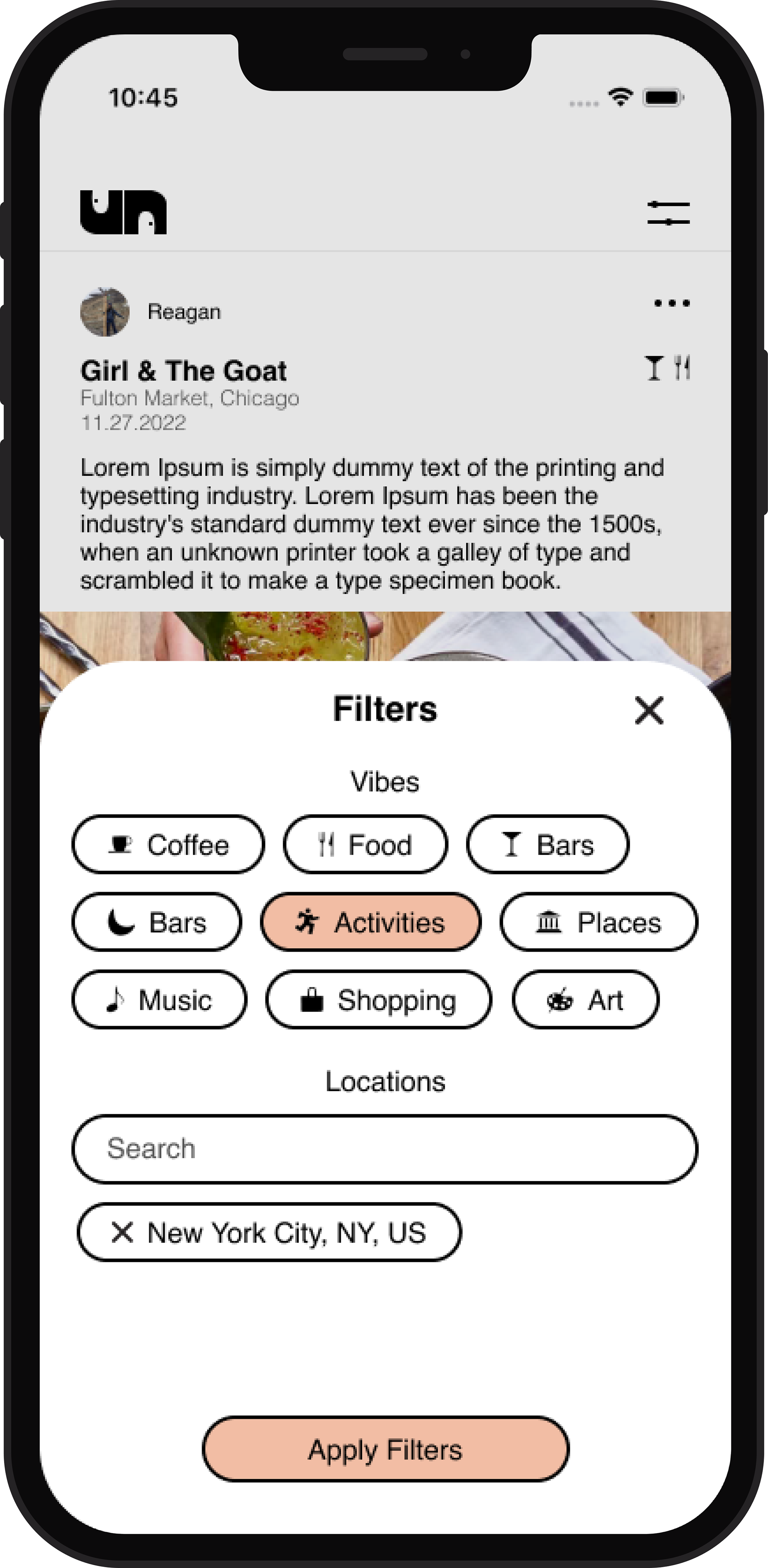
home page filters
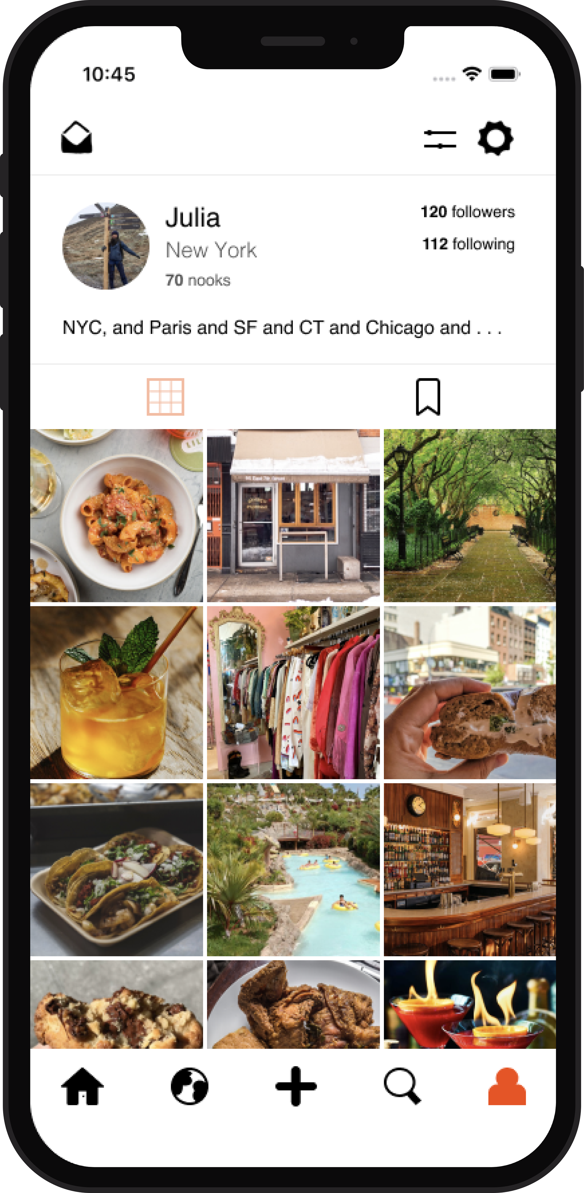
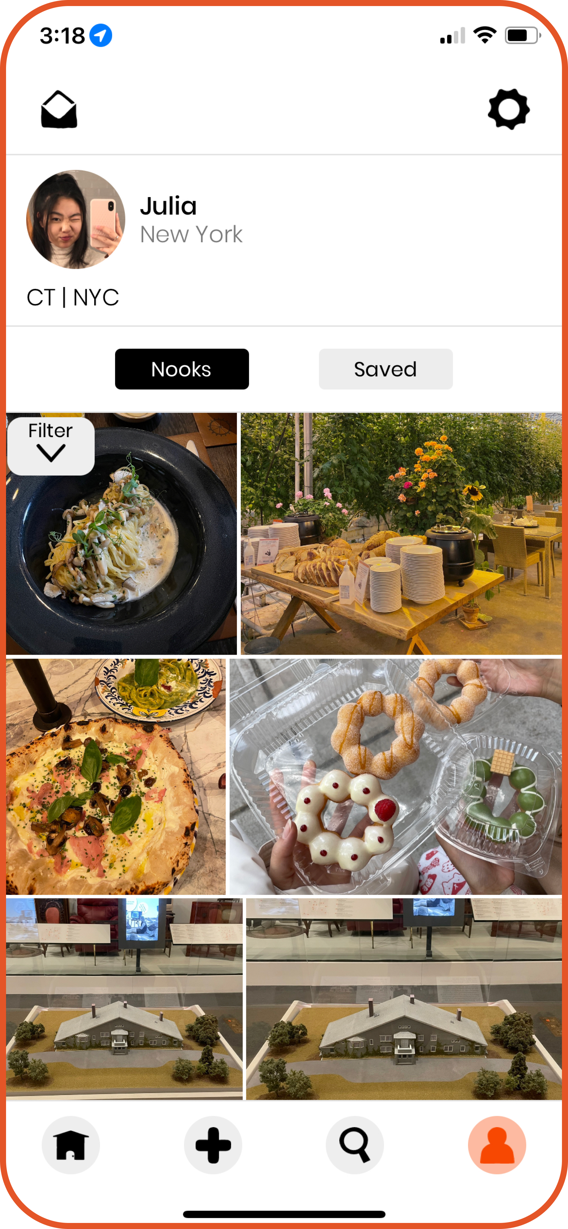
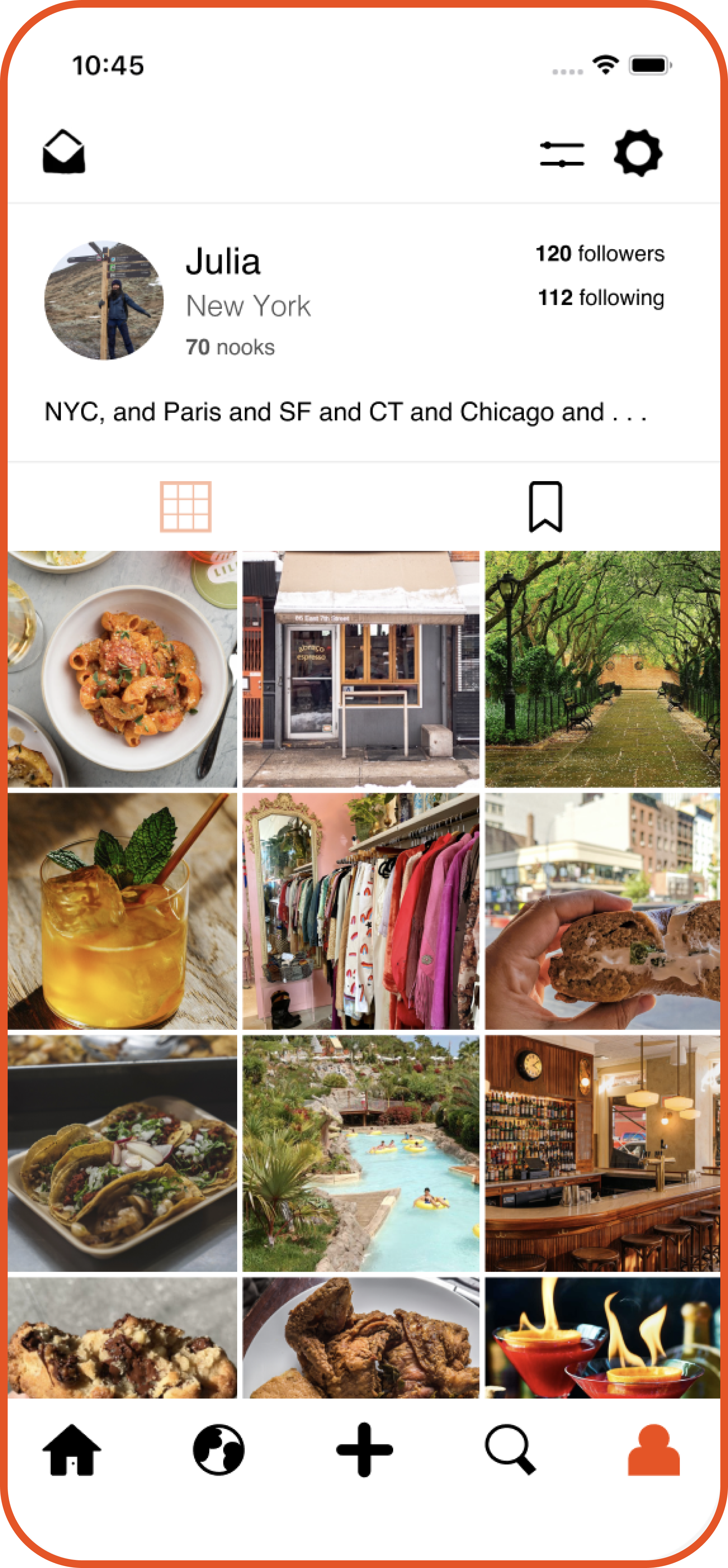
profile page
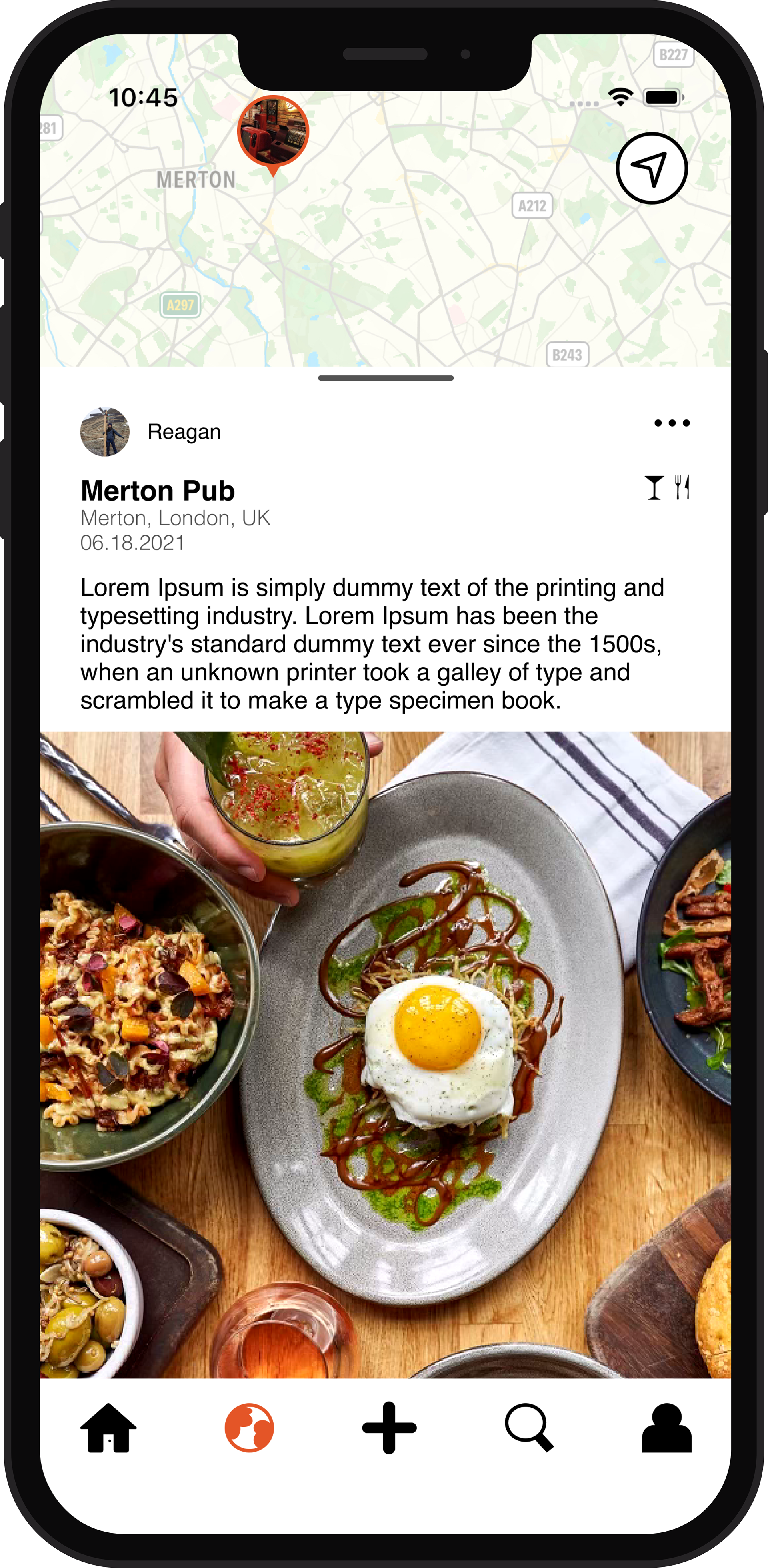
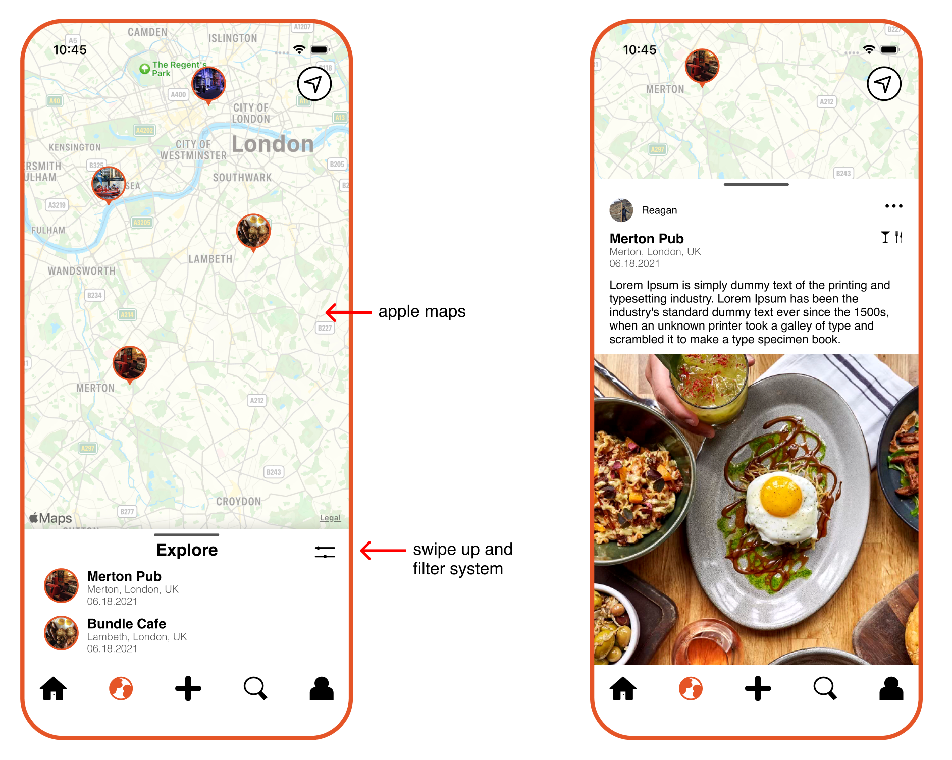
maps
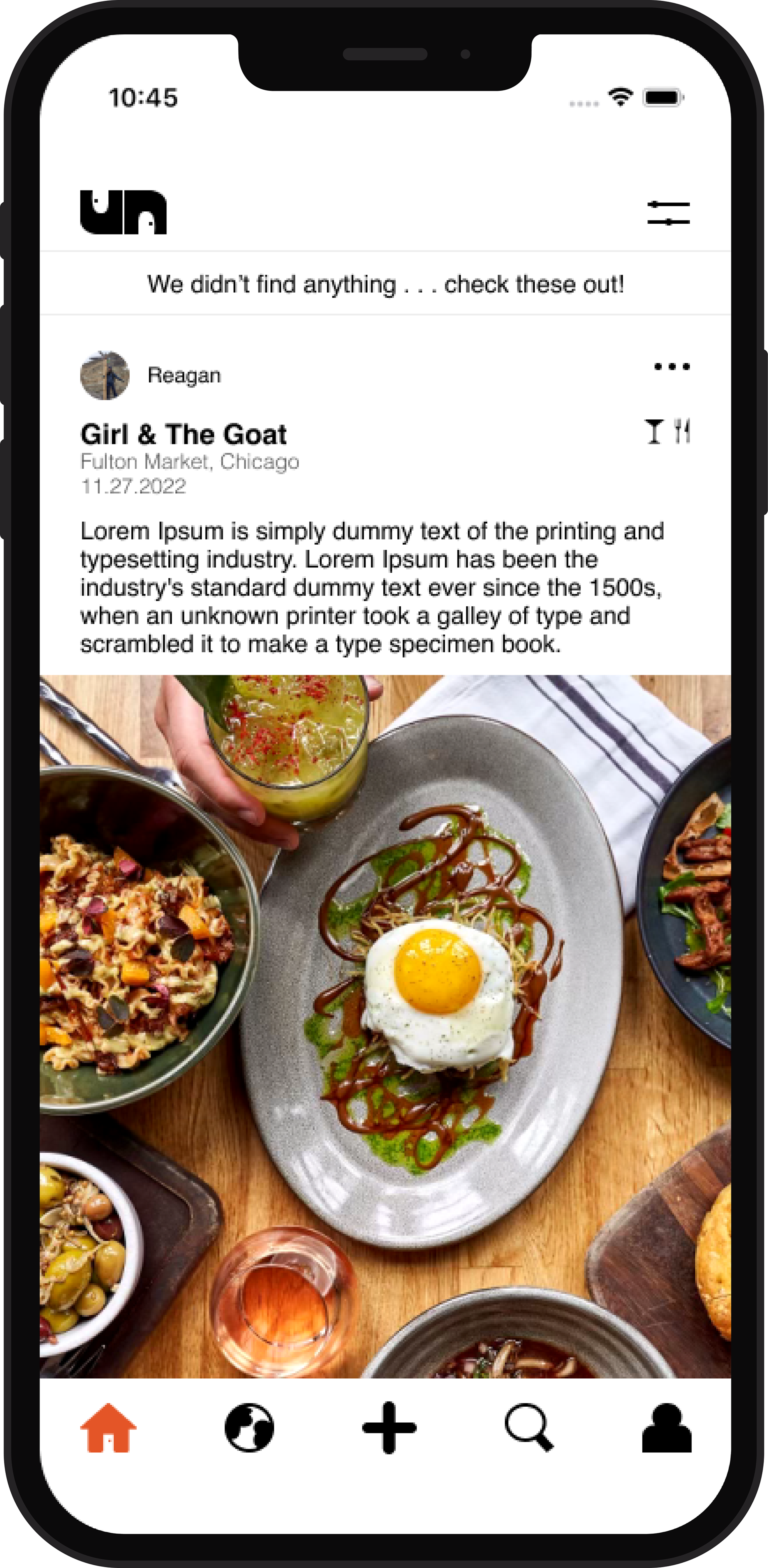
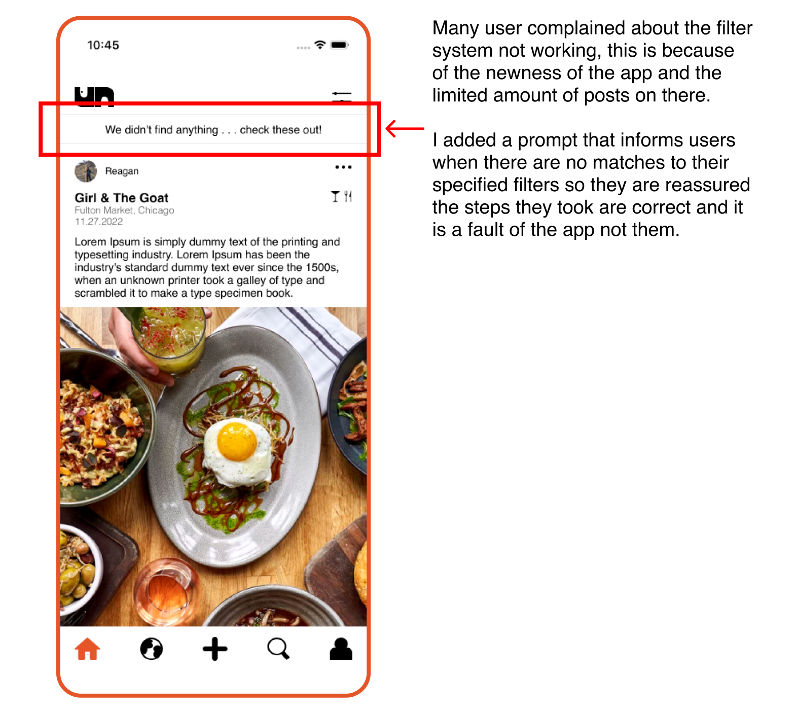
"we didn't find anything"
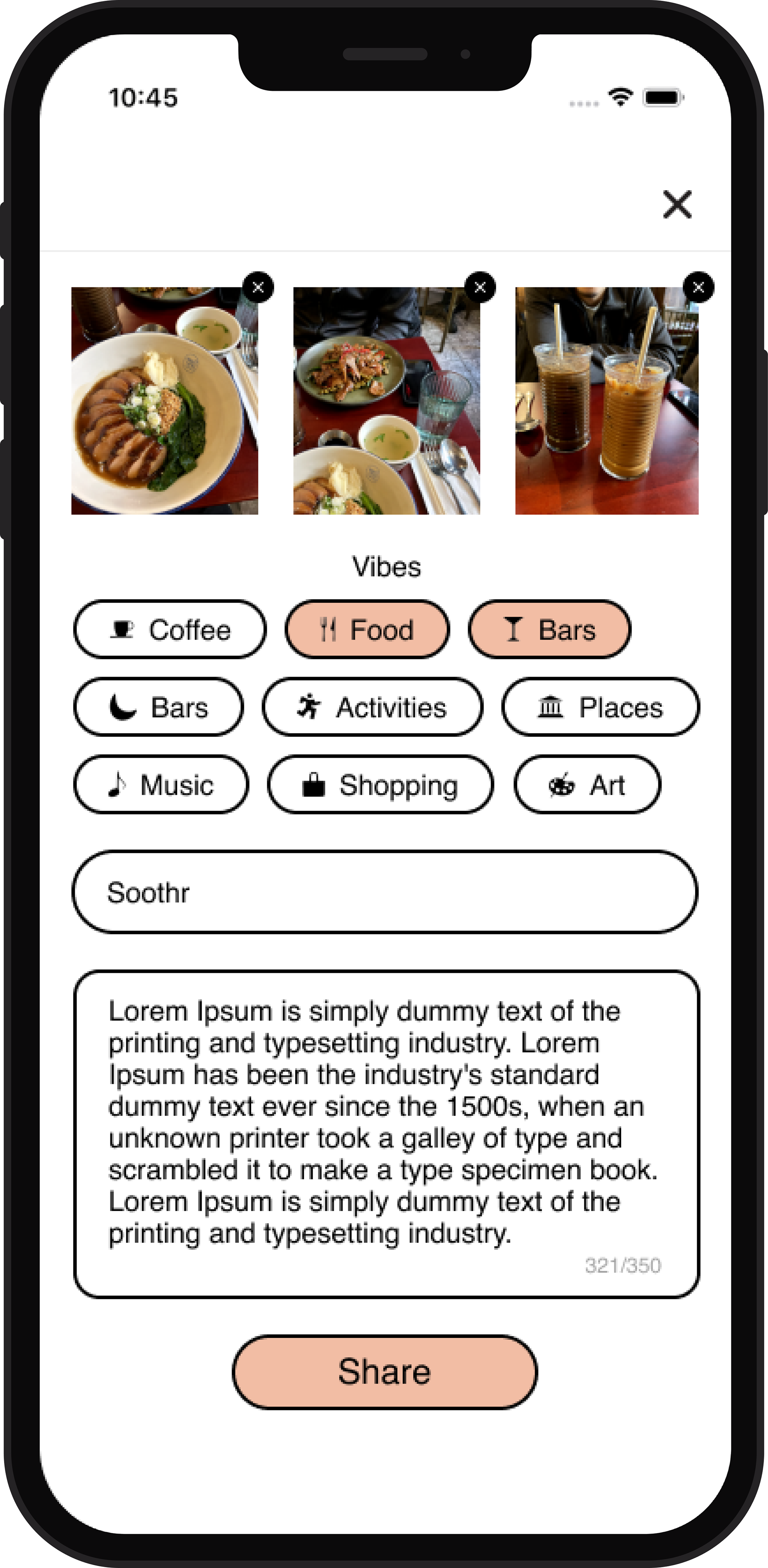
make a post page
Project Overview
Unfound is an app for “hidden gems”, also called “nooks”. Users can post places that they want more people to know about. Users are located globally.
PROBLEM:
The app's user flow is hard to use and many users expressed complaints about the filter system and the navigation.
PROJECT GOALS:
Grow the app's users by making it more intuitive and aesthetic.
PROBLEM:
The app's user flow is hard to use and many users expressed complaints about the filter system and the navigation.
PROJECT GOALS:
Grow the app's users by making it more intuitive and aesthetic.
What're the users saying?
I did research through looking at App Store reviews and doing competitive audits (like Instagram and Yelp). I also had users freely play around with the app and give me their first impression.
Research Findings:
App Store Reviews & Competitive Audits:
- Too wireframe like, making a post is not fun
- "Seems like there was no user testing"
- Bad filter system/ filters do not work
- Location and photos are very important and should be emphasized a lot more
- Too wireframe like, making a post is not fun
- "Seems like there was no user testing"
- Bad filter system/ filters do not work
- Location and photos are very important and should be emphasized a lot more
User Testing:
- Filtering icons aren't clear enough (coffee cup, tree, etc)
- Homepage/feed is very crowded
- Not a lot of things to do other than scroll
- The world feed is hard to find
- Filtering icons aren't clear enough (coffee cup, tree, etc)
- Homepage/feed is very crowded
- Not a lot of things to do other than scroll
- The world feed is hard to find
I also met with the founder, Yasmeena Faycurry, and got some insight from her. She informed me the biggest stress about the app is the feed and the way it is formatted. She agreed with many of the users and said it needed to be less crowded.
Wire Framing
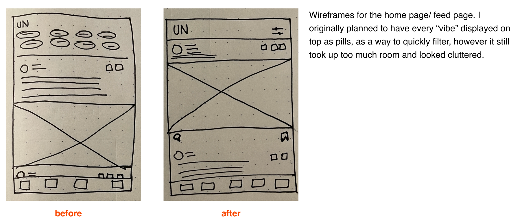
Iterating . . .
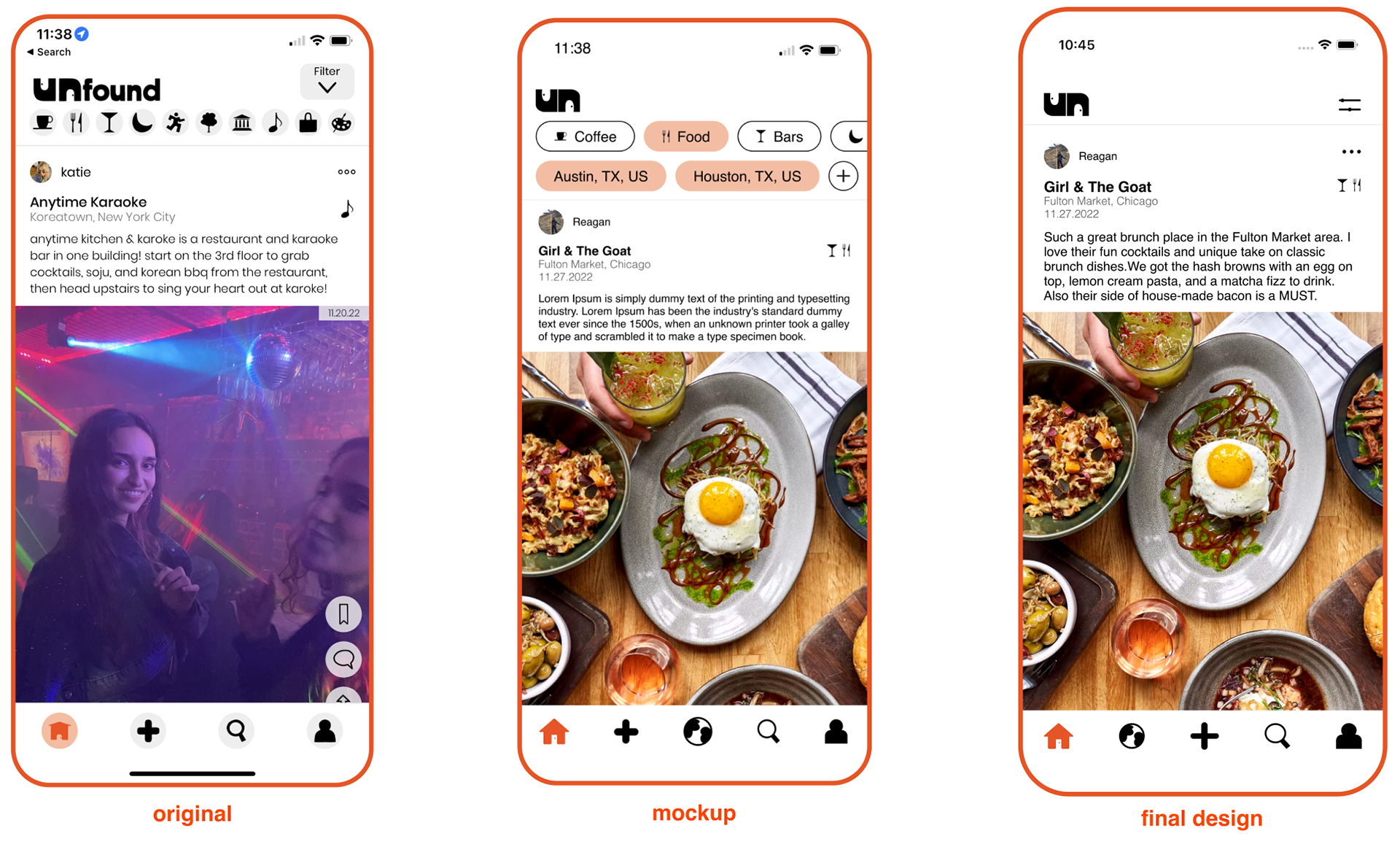
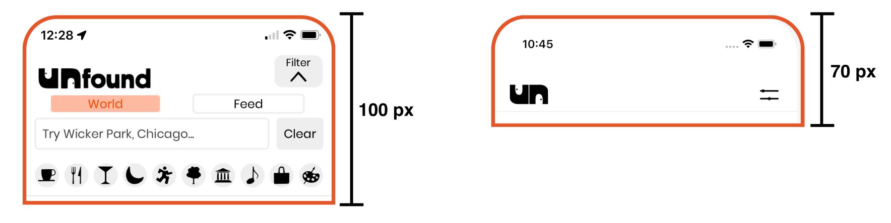
I was able to significantly decrease the height of the top bar on the home page, allowing more room for the posts to shine. I added a filter icon instead of having the filters visible from the start, to not put pressure on the users to use them.
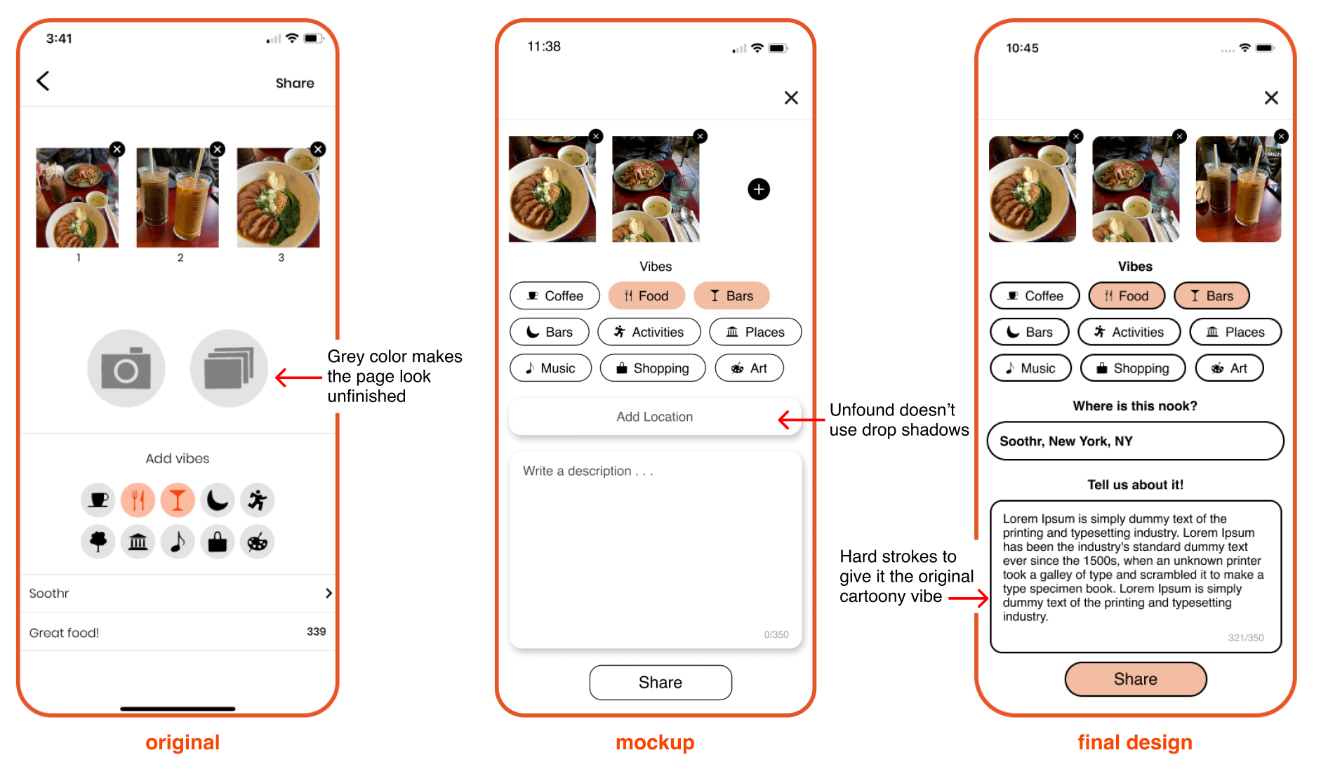
Designing the experience of making a post was important because this is what grows the app. I made the vibes more clickable through their pill format. I also added text boxes and prompts so users new exactly what they needed to do and the page was more broken up.
I took the "world" button which was previously on the top bar, and moved it to the bottom navigation bar.
To allow a better browsing experience, especially for travelers (which Unfound caters to), I changed this page from an explore feed page to a map. I made this change because the map will promote more exploration around the world and allow users to look at their specific location/ area in a bigger frame.
I designed these pages from scratch since there was not previously a map function.
final prototype
Conclusions and Takeaways
This project was a challenge but it paid off because I am proud of the end result. I do think I solved the filter problem by making it easier to use and as clear as possible. I learned a lot about Figma's auto layout and was able to improve my Figma skills. I was also able to get a better understanding on how user's interact with social medias.
Moving forwards, I hope to add even more to this prototype and hopefully get it developed for the actual app. I want to included an option to filter by distance because users expressed interest in being able to do that.
Moving forwards, I hope to add even more to this prototype and hopefully get it developed for the actual app. I want to included an option to filter by distance because users expressed interest in being able to do that.