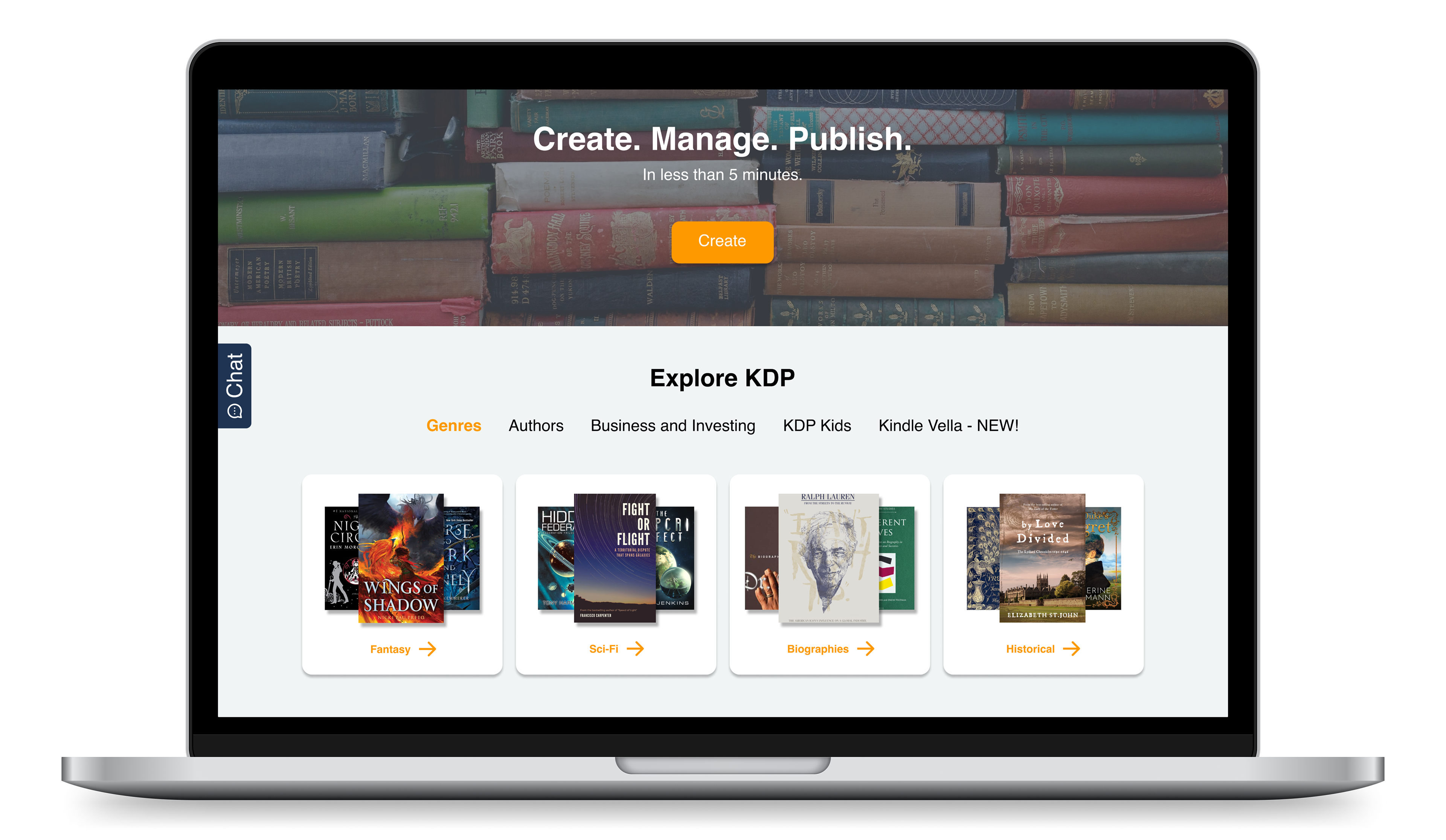
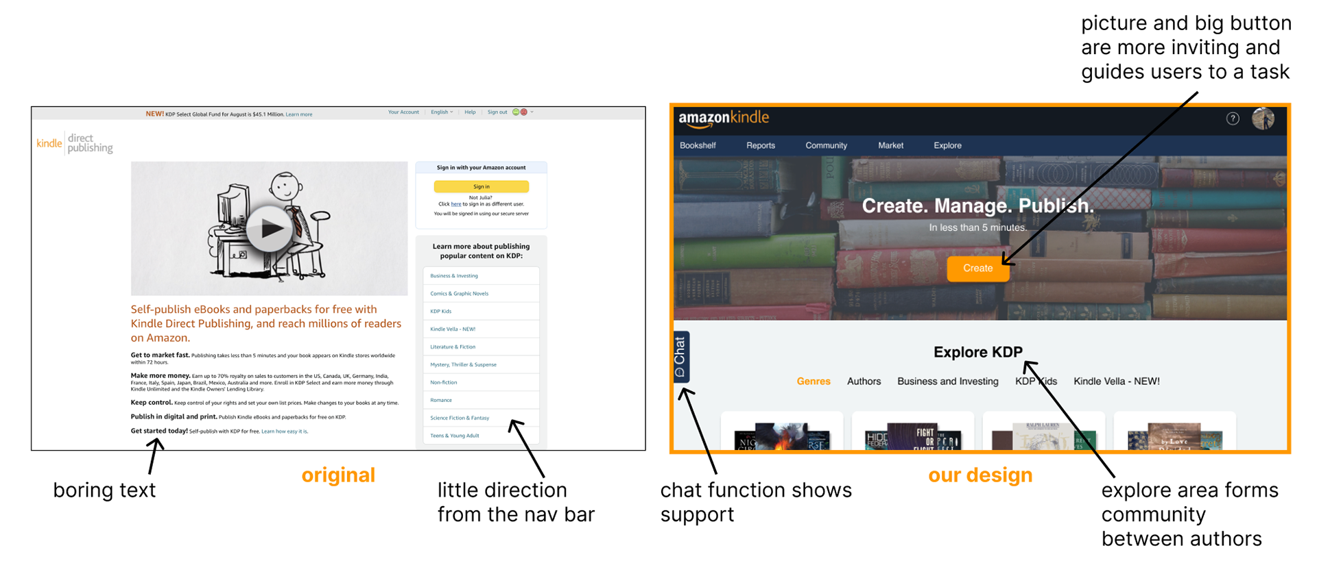
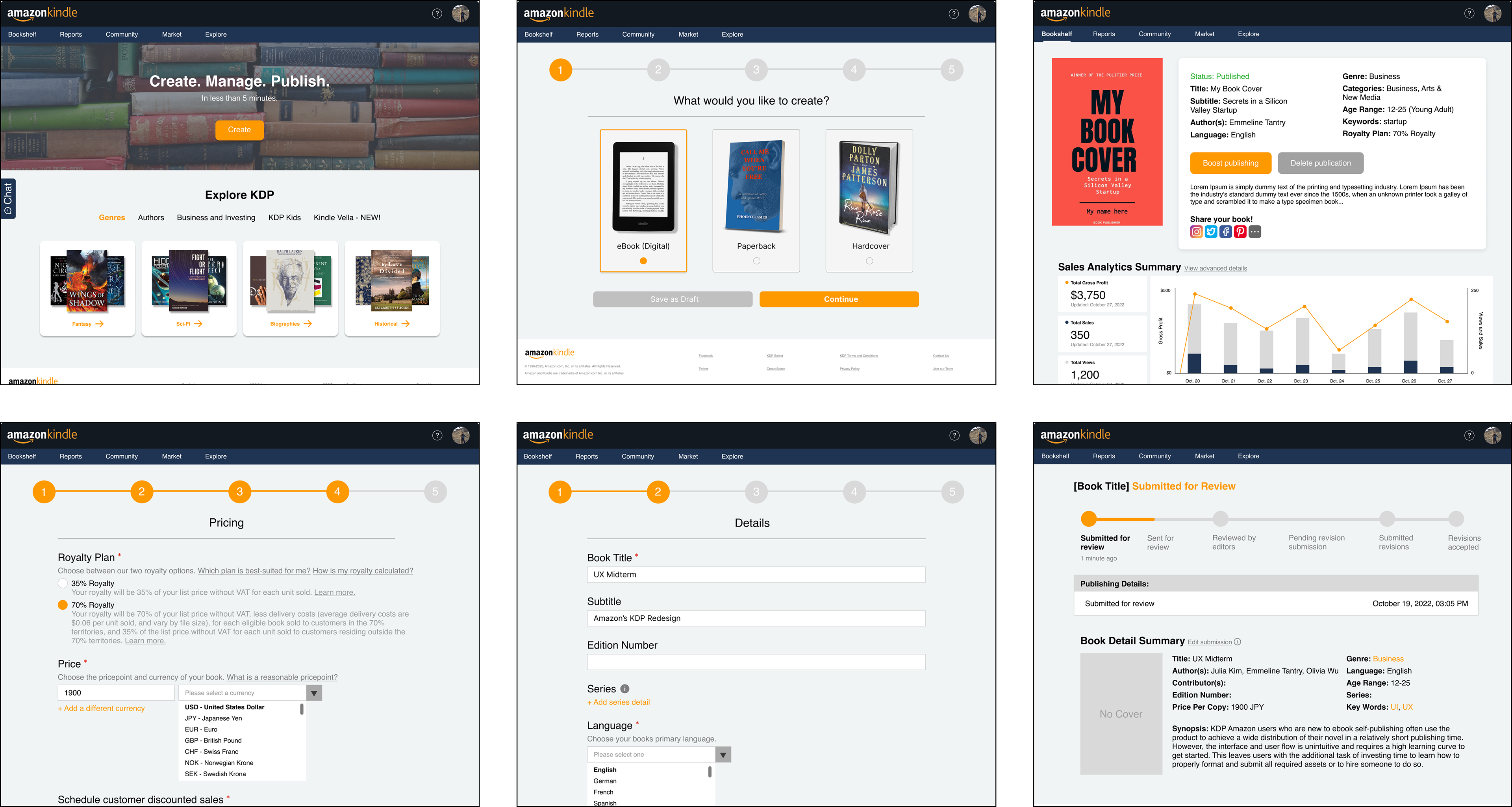
Amazon KDP is a self-publishing platform that allows people to publish ebooks, paperbacks, etc. for free. KDP Amazon users new to ebook self-publishing often use the product to achieve a wide distribution of their novel in a relatively short publishing time. I redesigned a new, more user-friendly project creation form to make the website more welcoming to people new to e-publishing.
Role: Designer (team of 3 total)
Duration: 2 months
Skills: Figma, Competitive Audits, User Surveys
Project Overview
I worked with a team of two other students to reimagine Amazon's Kindle Direct Publishing (KDP) project creation feature.
DISCLAIMER: Amazon KDP has resigned their site so the site I go off of throughout this project is no longer up.
PROBLEM:
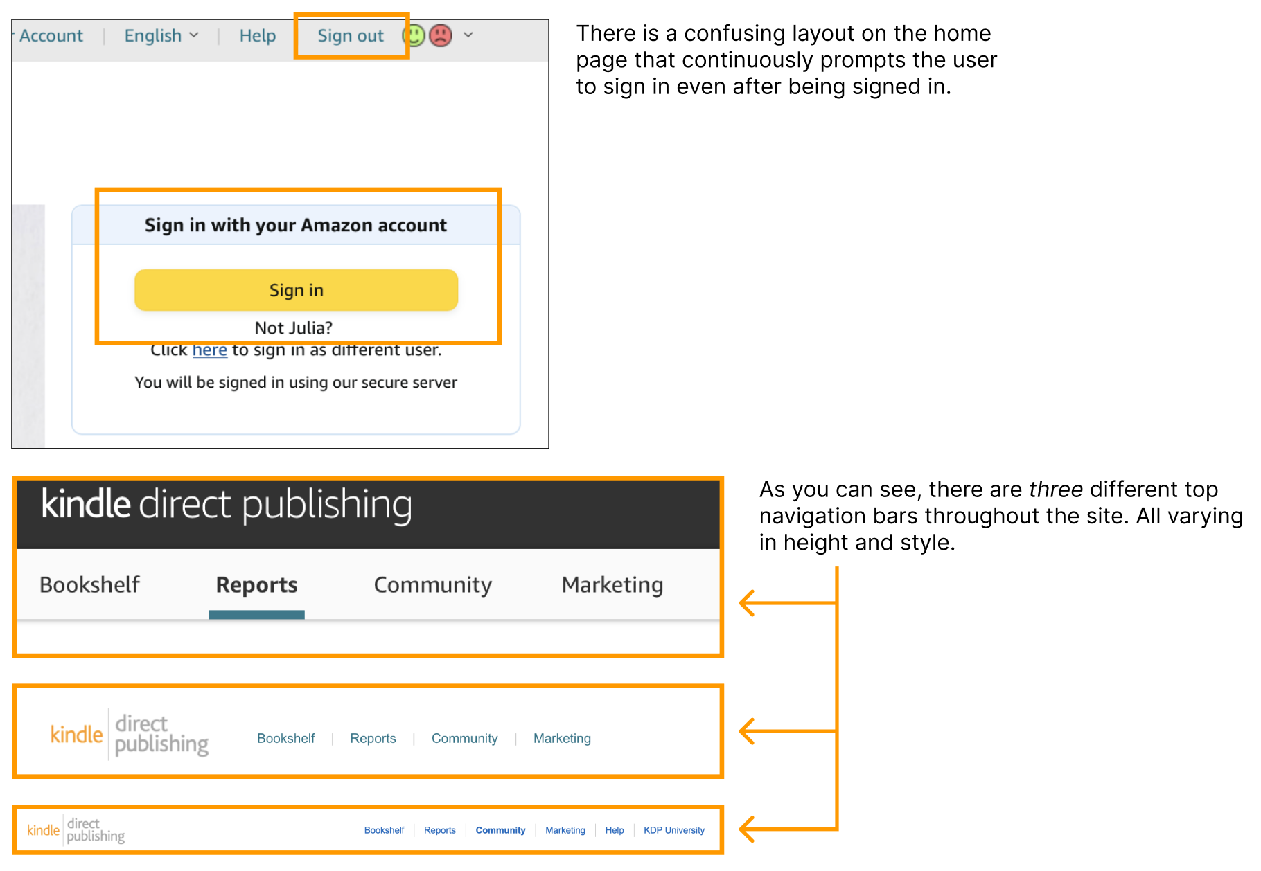
- The user flow is unintuitive and requires a high learning curve to get started. This leaves users with the additional task of investing time to learn how to properly format and submit all required assets or to hire someone to do so.
- The site’s UI is inconsistent with Amazon branding. The overall look is drab and isn’t what excited authors should be seeing when publishing their books.
- The book creation form is not user friendly because it prompts users with less important questions first and requires you to have all assets (transcript, cover art, etc.) ready and complete.
PROBLEM:
- The user flow is unintuitive and requires a high learning curve to get started. This leaves users with the additional task of investing time to learn how to properly format and submit all required assets or to hire someone to do so.
- The site’s UI is inconsistent with Amazon branding. The overall look is drab and isn’t what excited authors should be seeing when publishing their books.
- The book creation form is not user friendly because it prompts users with less important questions first and requires you to have all assets (transcript, cover art, etc.) ready and complete.
PROJECT GOALS:
Design a simple and easy to use project creation experience because that is the platform’s main purpose.
Design a simple and easy to use project creation experience because that is the platform’s main purpose.
Research and Competitive Analysis
We conducted a competitive analysis on a few other major book publishing sites to find common and best practices throughout them.
Competitors & their strengths:
Webtoon
- Has a clean user interface with clear visual cues of how to use it
Draft2Digital
- Streamlines miscellaneous aspects of publishing to allow authors to focus on writing
Kobo
- Provides detailed analytics insights of published books
Gumroad
- Makes it easier to grow a niche audience to their publishing through customization options
INITIAL CONCLUSION AND IDEAS:
- Create an easier book submission process with clear language/formatting on what is and isn't accepted.
- Allow for edits to form submission.
- Make it easier to tracking submissions and analytics insight including post publication insights.
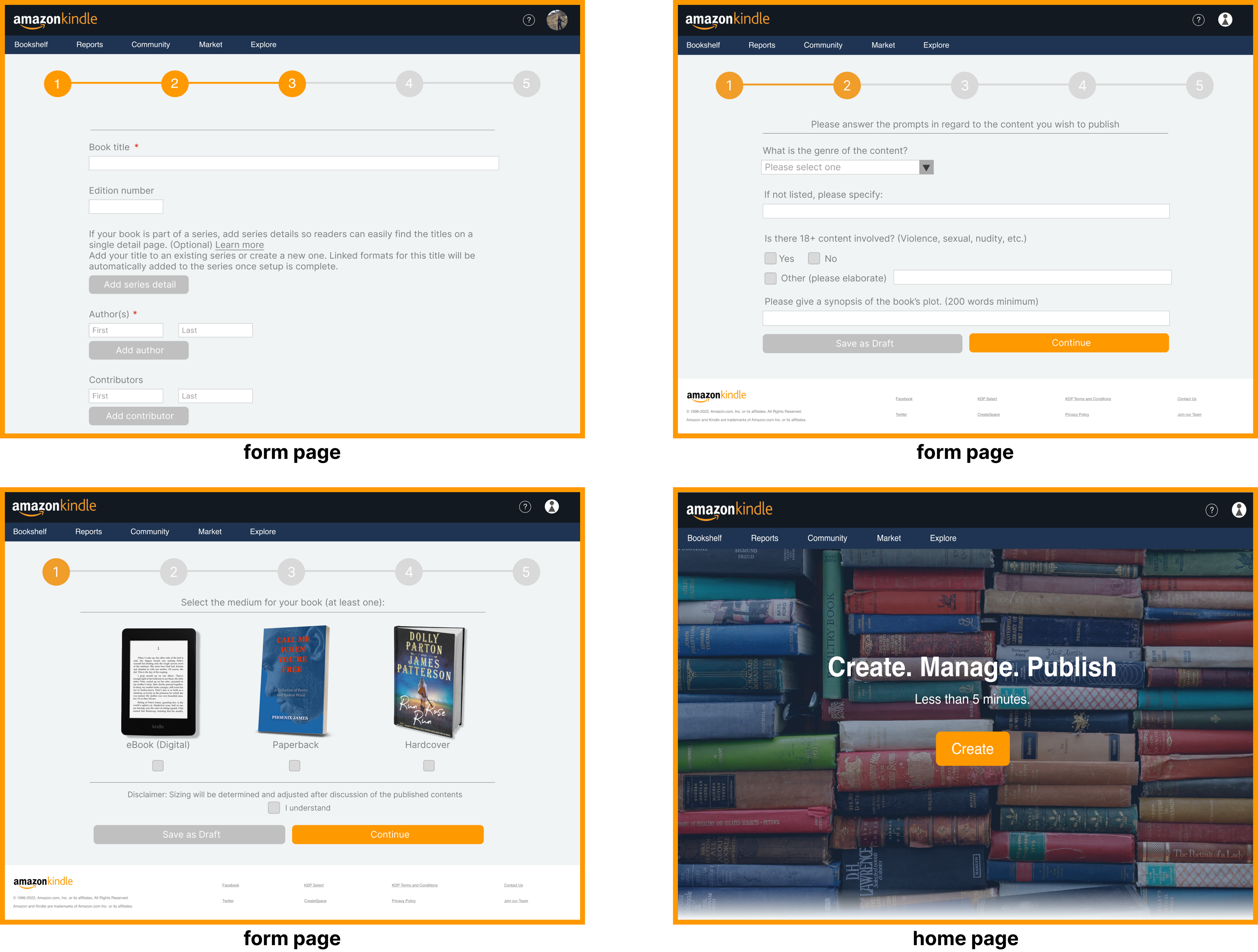
Laying out the sections
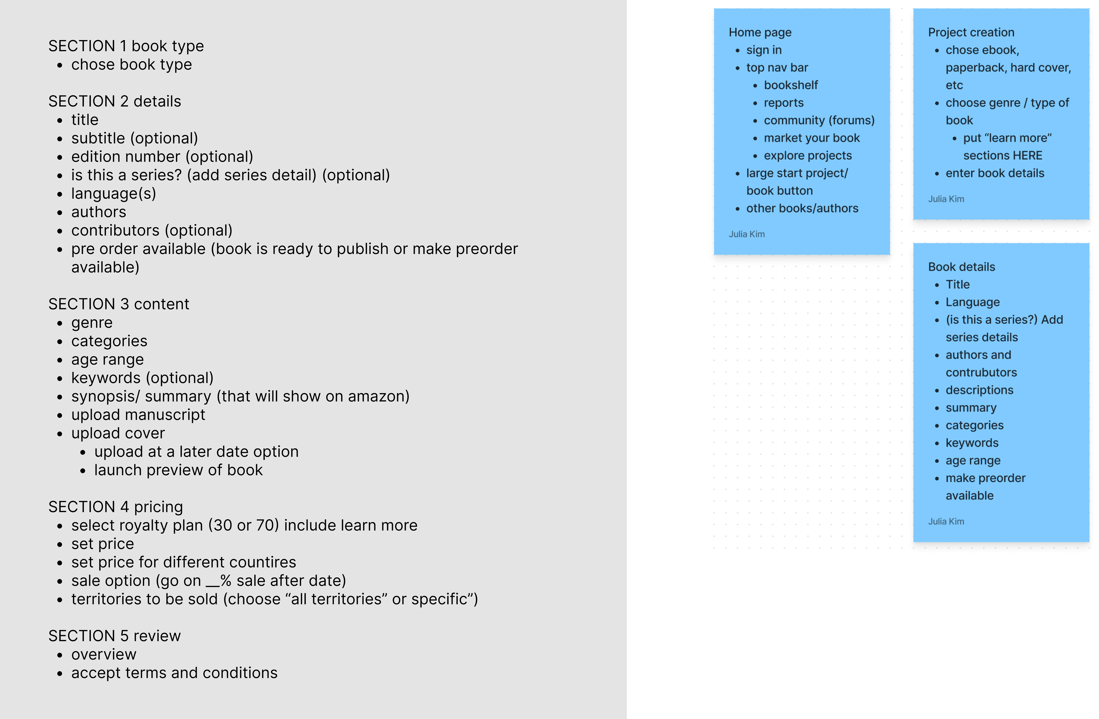
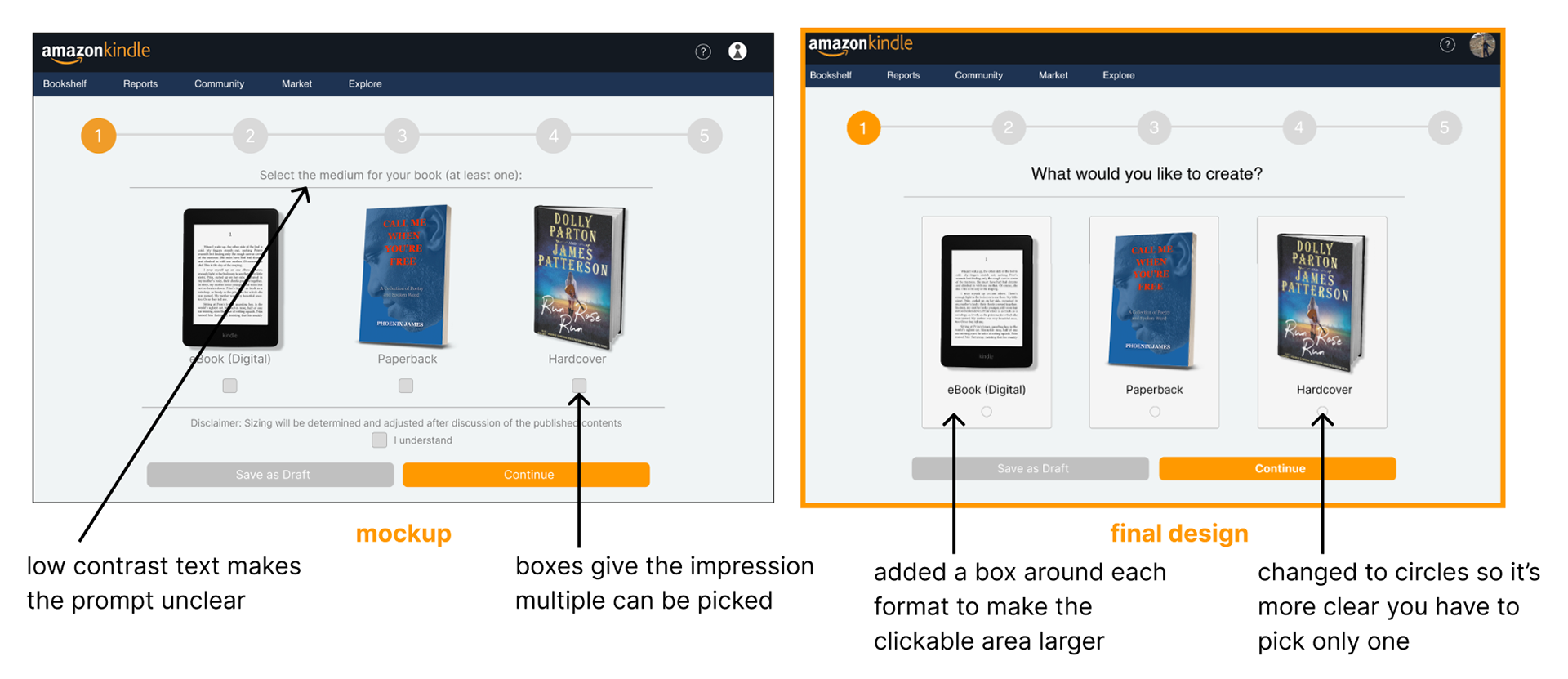
Mockups
After making mockups, I conducted unmoderated usability studies by sending out our designs and having users, writing students, attempt to successfully fill out a form for a new eBook. Here is the feedback we received:
Wins:
- The purpose of our site was clear
- The UI shows a clear sequential path and is self-explanatory
- Big buttons
- Overall visually nice to look at
- Useful shipping tracker/confirmation page
- The purpose of our site was clear
- The UI shows a clear sequential path and is self-explanatory
- Big buttons
- Overall visually nice to look at
- Useful shipping tracker/confirmation page
Pain Points:
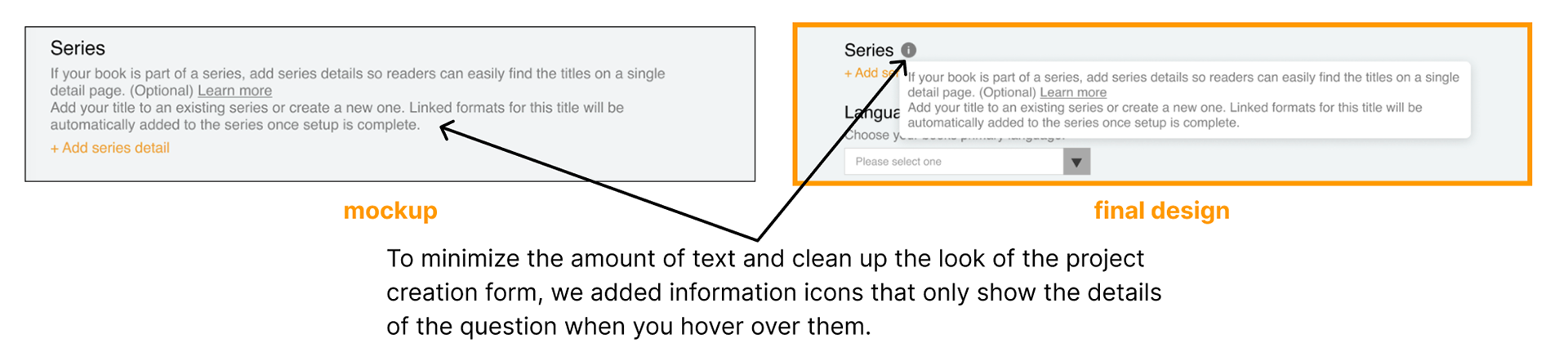
- Too much text on the screen
- Low contrast text makes instructions unclear
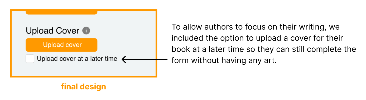
- "What if I don't have a book cover yet?"
- Too much text on the screen
- Low contrast text makes instructions unclear
- "What if I don't have a book cover yet?"
Addressing the Pain Points
Final Designs
final prototype:
Conclusion and Takeaways
Some of our initial assumptions were proved incorrect after conducting usability testing. (Showing detailed instructions in the project creation frames proved to be too much for users to look at). I learned lots of technical aspects of using Figma during this project.
In the future, I will make sure to use Figma components a lot more especially on large scale projects like this with many repeating frames. I will also make use of auto-layout because I often found myself having to manually make the same changes on different pages.
In the future, I will make sure to use Figma components a lot more especially on large scale projects like this with many repeating frames. I will also make use of auto-layout because I often found myself having to manually make the same changes on different pages.