The MTA employee portal was outdated, causing a slow down in employee work. In this project, I lead user research to find key insights on areas of improvement for the website. I also redesigned important sections of the site including the top & bottom navigation bars.
Role: UX Researcher and Designer, Intern
Duration: 5 months
Skills: Figma, User Interviews, Prototyping, Wire Framing
Employees could not complete their work in a timely manner due to a portal with messy user flow & dead ends
As part of my internship at the MTA, I worked with 3 other interns and 2 UX designers to completely redesign the information architecture and the user interface of the employee portal, MTA Today. The goals were to gather feedback on how different employees use the current site and discover how we can make it better through design to speed up their workflow.
What Did Employees Think of their Current Site?
I lead the user research and testing part of the design process. I scheduled interviews, wrote interview questions, and conducted calls with employees from all departments within MTA, both field and office. Because the site had been very clogged and un updated for a very long time, many employees were willing to participate in our research.
Research goals, Round 1 (User Interviews):
Empathize with the employees and find out how they use the website through user interviews I conducted.
Research goals, Round 1 (User Interviews):
Empathize with the employees and find out how they use the website through user interviews I conducted.
Research goals, Round 2 (Affinity Mapping):
I gathered all of our findings from the user interviews and sorted them into pain points, expectations, and tasks.
I gathered all of our findings from the user interviews and sorted them into pain points, expectations, and tasks.
Research goals, Round 3 (Competitive Audits):
I studied the companies who had successful and well rated employee portals to find a common theme of what they were doing right and what worked for them.
I studied the companies who had successful and well rated employee portals to find a common theme of what they were doing right and what worked for them.
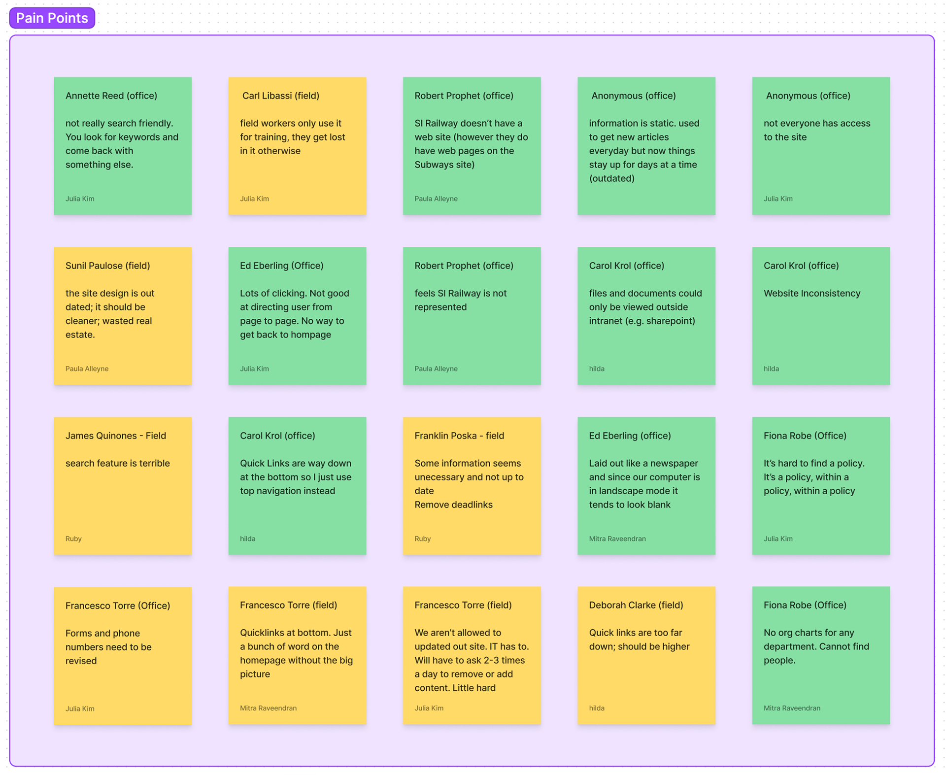
Pain Points
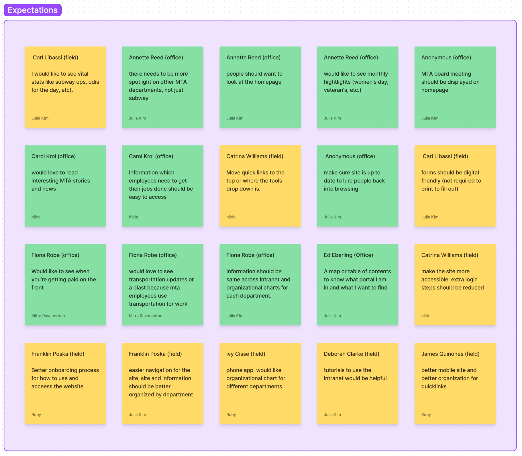
Expectations

Tasks done with the site

Overall Research Findings about the MTA's employee portal:
- Poor visual hierarchy
- Outdated look
- "Quick Links" are hard to find
- Unfair focus on certain departments
- Minimum website requirements not met (search, mobile accessibility)
- Poor visual hierarchy
- Outdated look
- "Quick Links" are hard to find
- Unfair focus on certain departments
- Minimum website requirements not met (search, mobile accessibility)
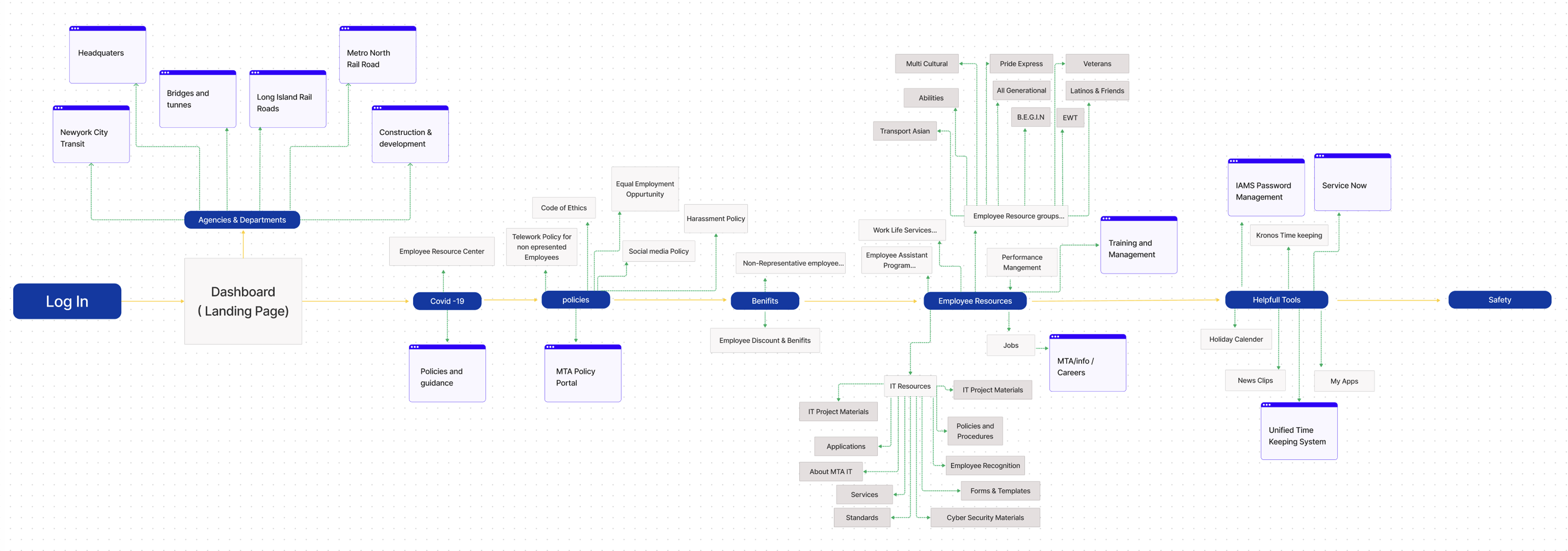
Finding the best User Flow
Here is the user flow we created from our findings:
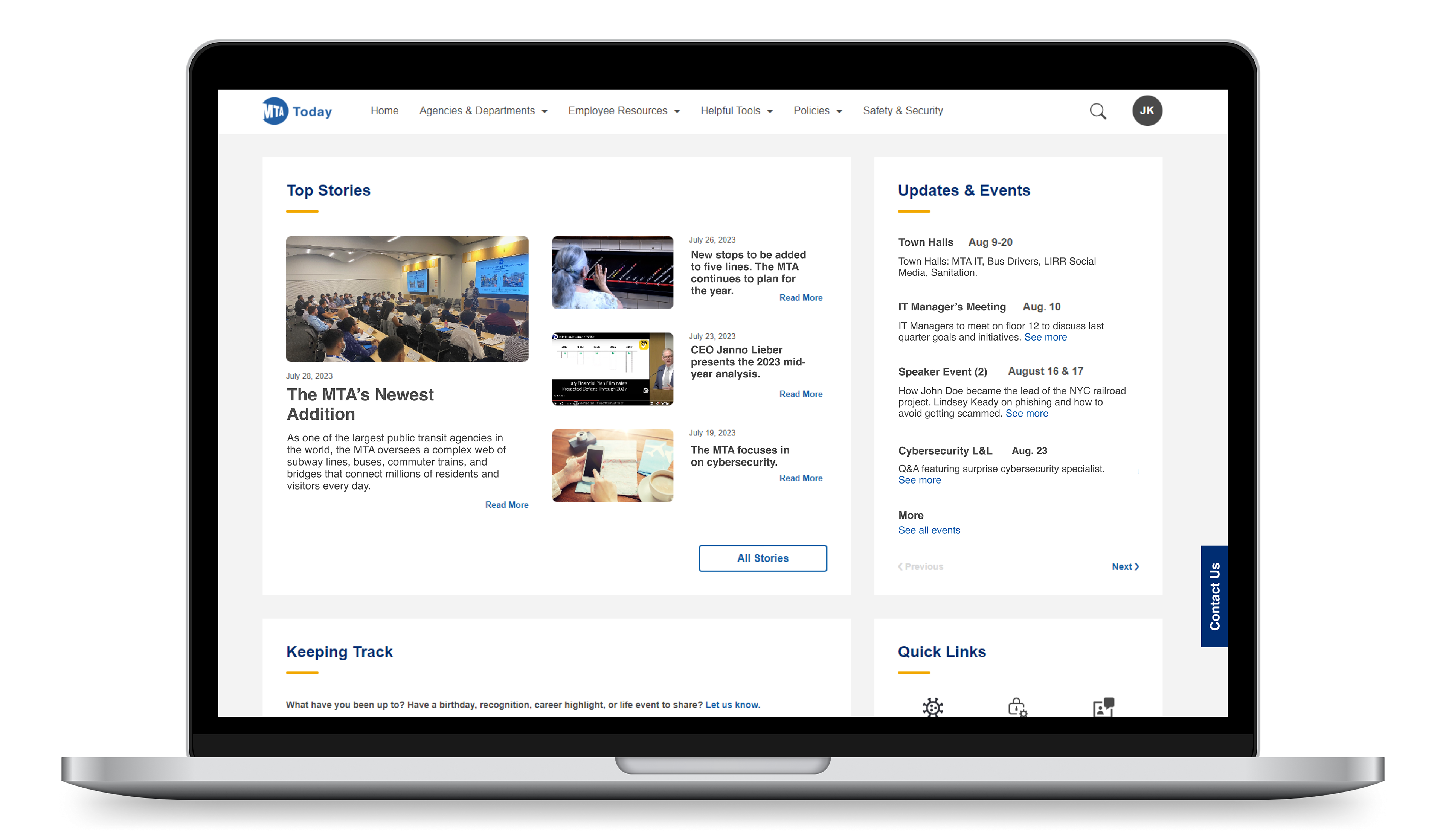
Screenshots of Before and Afters
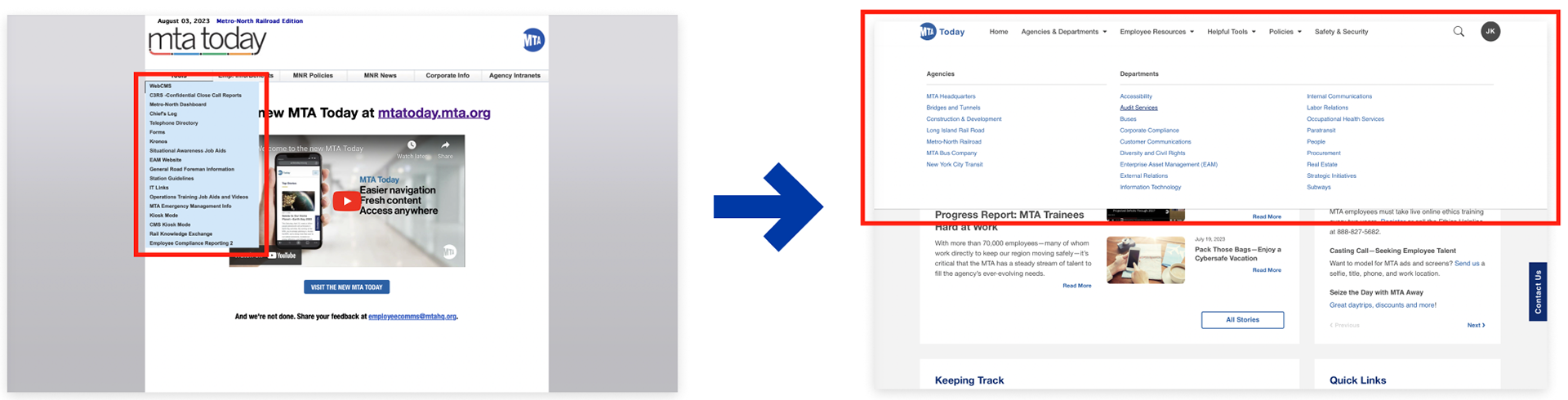
Drop Down Menus/ Top Navigation
The whole top navigation bar of the original site took up more space than it needed to.
The whole top navigation bar of the original site took up more space than it needed to.
- Expanding the contents to make efficient use of all the space on screen
- Expanding the dropdown menu to allow more room to breath and browse the links
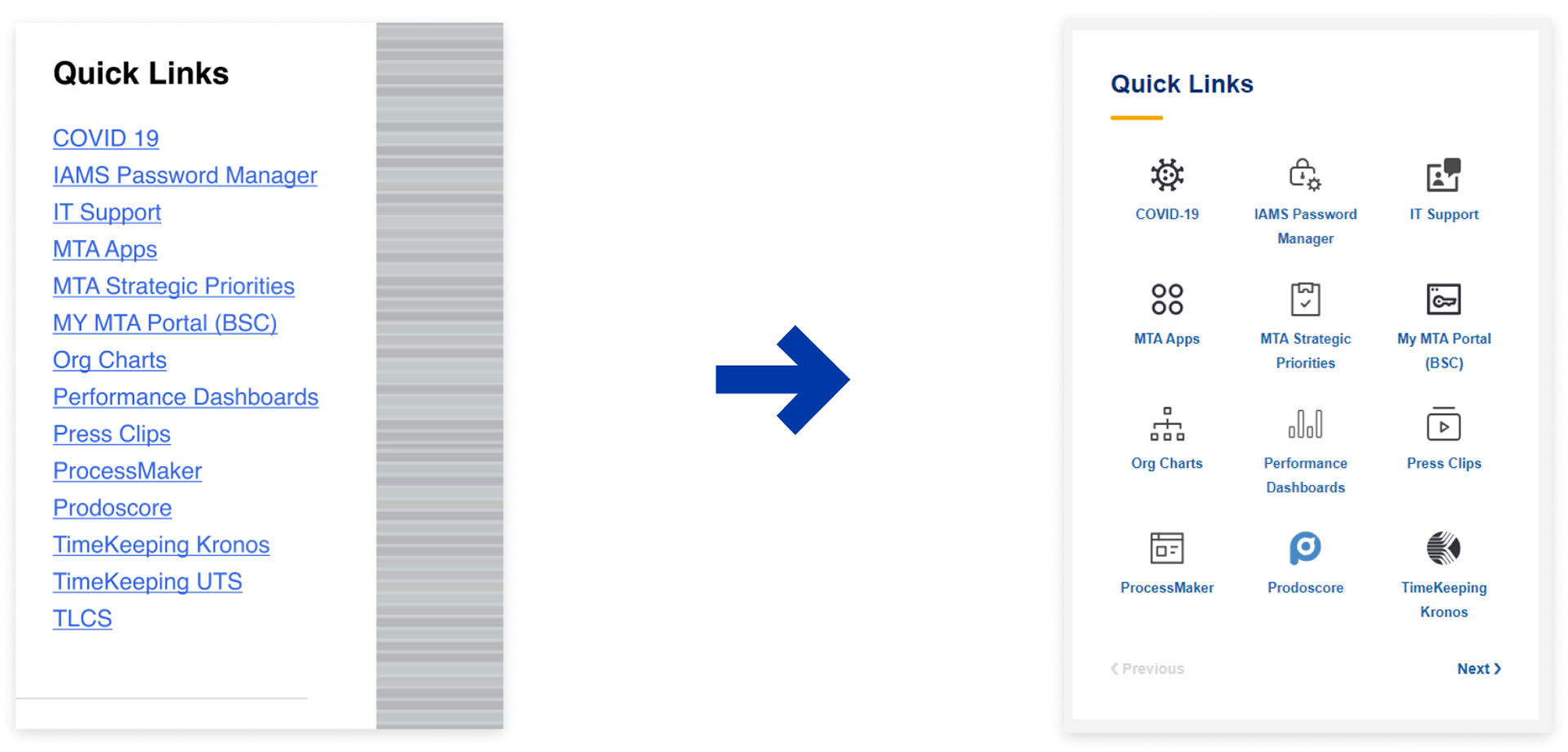
Quick Links
The original Quick Links was quite literally a list of links. We designed it to be more spread out and I designed icons to go with each task for added visual accessibility.
The original Quick Links was quite literally a list of links. We designed it to be more spread out and I designed icons to go with each task for added visual accessibility.
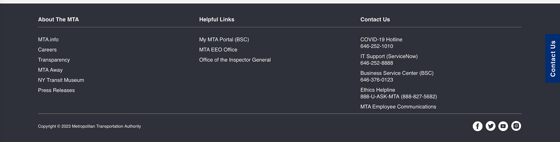
Bottom Navigation
The original bottom navigation was non-existent so I helped to design one from scratch with more helpful links that employees access daily.
The original bottom navigation was non-existent so I helped to design one from scratch with more helpful links that employees access daily.
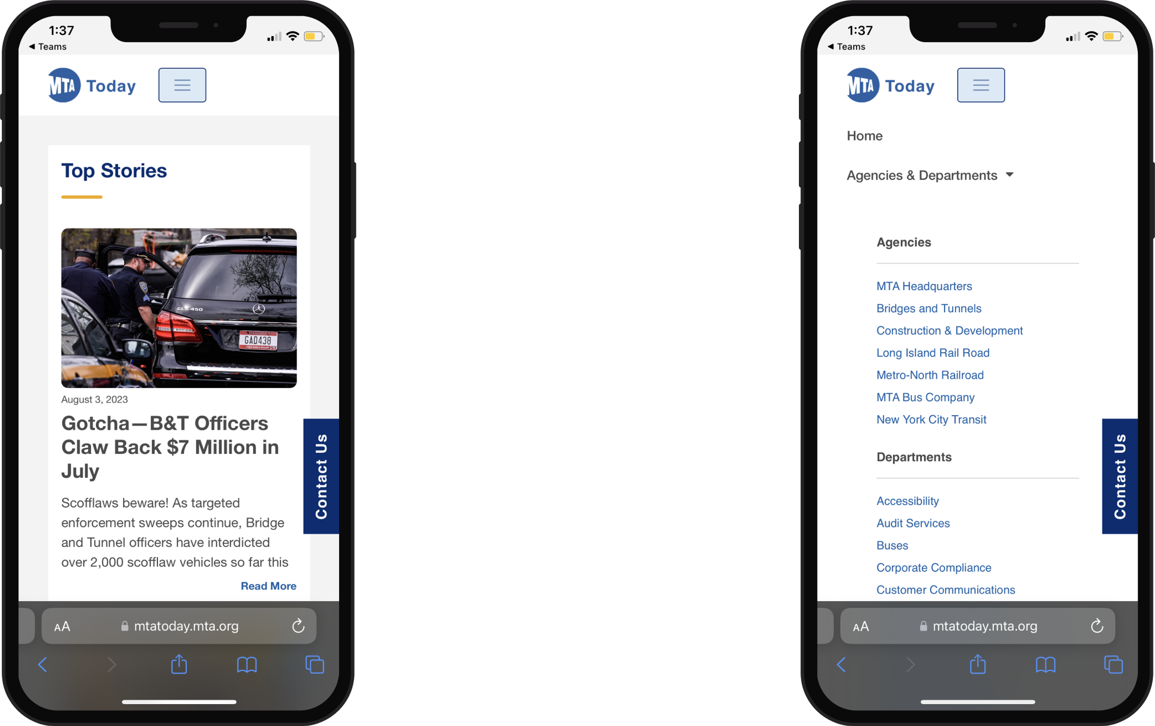
Final Frames


Conclusions and Takeaways
This project resulted in satisfied employees and an overall decrease in time spent navigating the website, meaning an increase in employee productivity. Our next steps are to redesign the sites of each department using the design components we made to create a cohesive look and feel throughout all MTA employee intranets.
From this project I was able to fine-tune my user interview and collaborative skills.