

The Weee! grocery delivery app did not have as many users as I'd excepted. I designed a new "Meal Planning" feature which aims to bring more people to the app for longer periods of time.
Role: Sole Designer
Duration: 3 months
Skills: Figma, User Interviews, A/B Testing, Competitive Audit, Wire Framing
Introduction
Weee! is an app that offers delivery for Asian and Hispanic groceries. I wanted to make this project because I am a long-time fan of the app and I wanted to challenge myself to make something already good, better. I planned to go through the standard UX design process of completing user interviews, creating user stories, and continuously iterating until I reached a product I am happy with.
Finding areas to improve, and not getting the feedback I'd hoped for
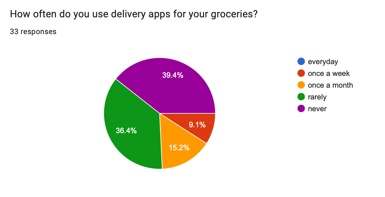
I completed a total of 3 rounds of mass user interviews throughout this process. I used a mix of google forms, A/B testing, and moderated usability testing. I also performed competitive audits on UberEats, Instacart, and Getir.
Research goals:
Find the pain points of the current app and learn how my users felt about grocery delivery apps on the market in general.
Research goals:
Find the pain points of the current app and learn how my users felt about grocery delivery apps on the market in general.
Here are my findings:
- They would like the option to be able to specify produce (ex. green banana, more yellow banana, larger bunch)
- Too many unrelated popups
- They would like the option to be able to specify produce (ex. green banana, more yellow banana, larger bunch)
- Too many unrelated popups
The users I had access to to fill out my forms almost never used grocery delivery apps.
But how can I get people interested in using Weee!?
One suggestion caught my eye: recipe ideas based on ingredients.
From this suggestion, I developed a new project goal.
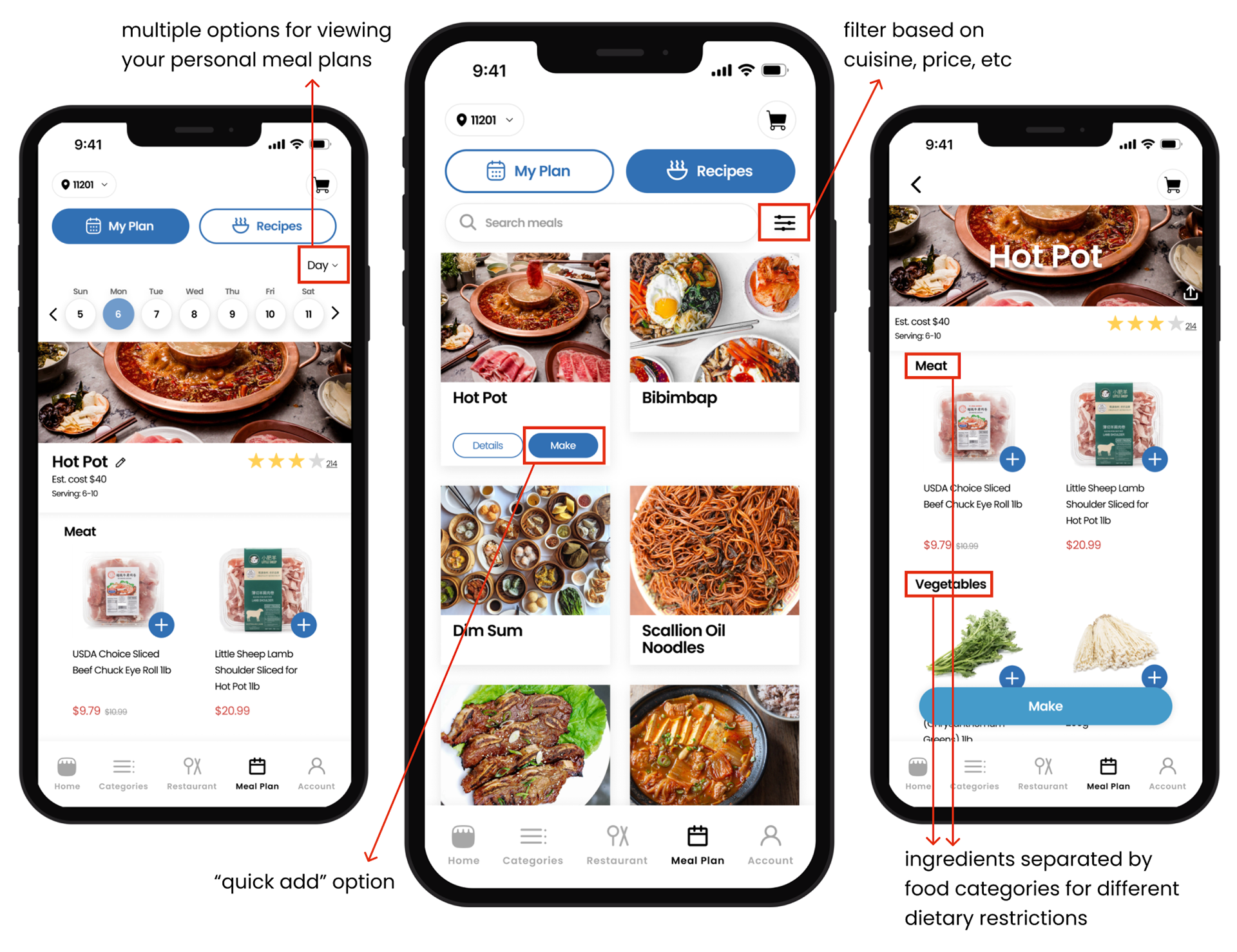
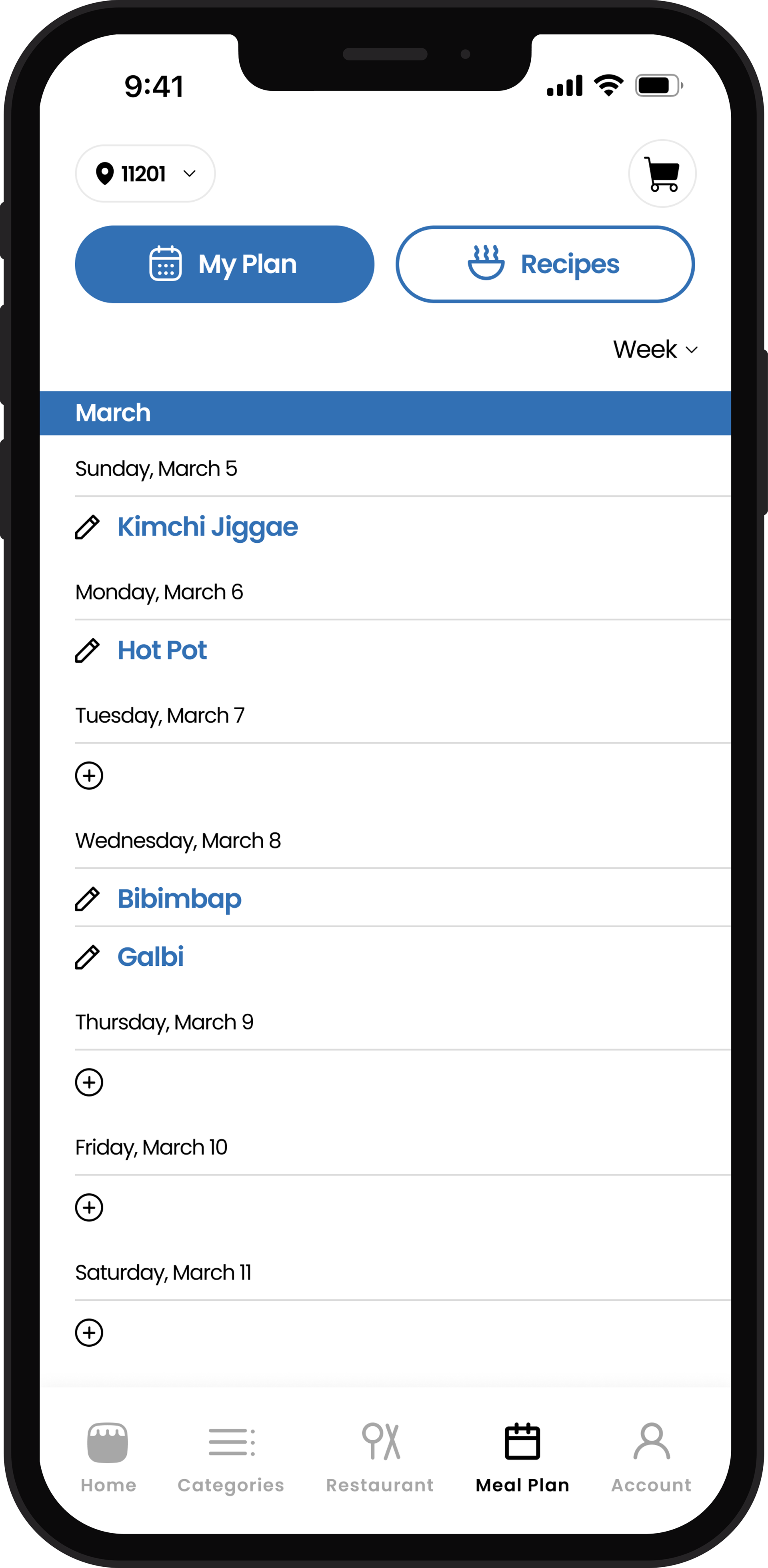
My new goal was still to clean up the app's look, but now I wanted to create a way for users to meal plan. Weee! will now recommend recipes in a new section called “Meal Plan”. By adding a new feature that includes a browsable layout and a calendar based page, time spent on the app may increase and draw more people in.
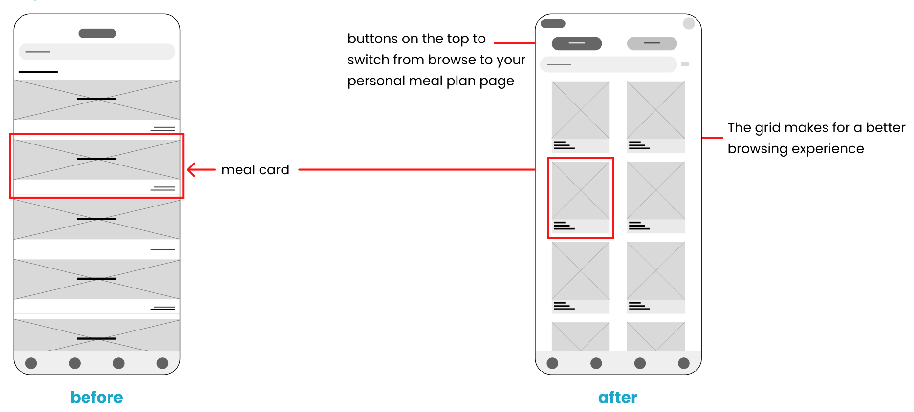
I started with wire framing my idea.
I drew inspiration from recipe apps like the NYT Cooking and made sure to follow basic design guidelines for browse pages.
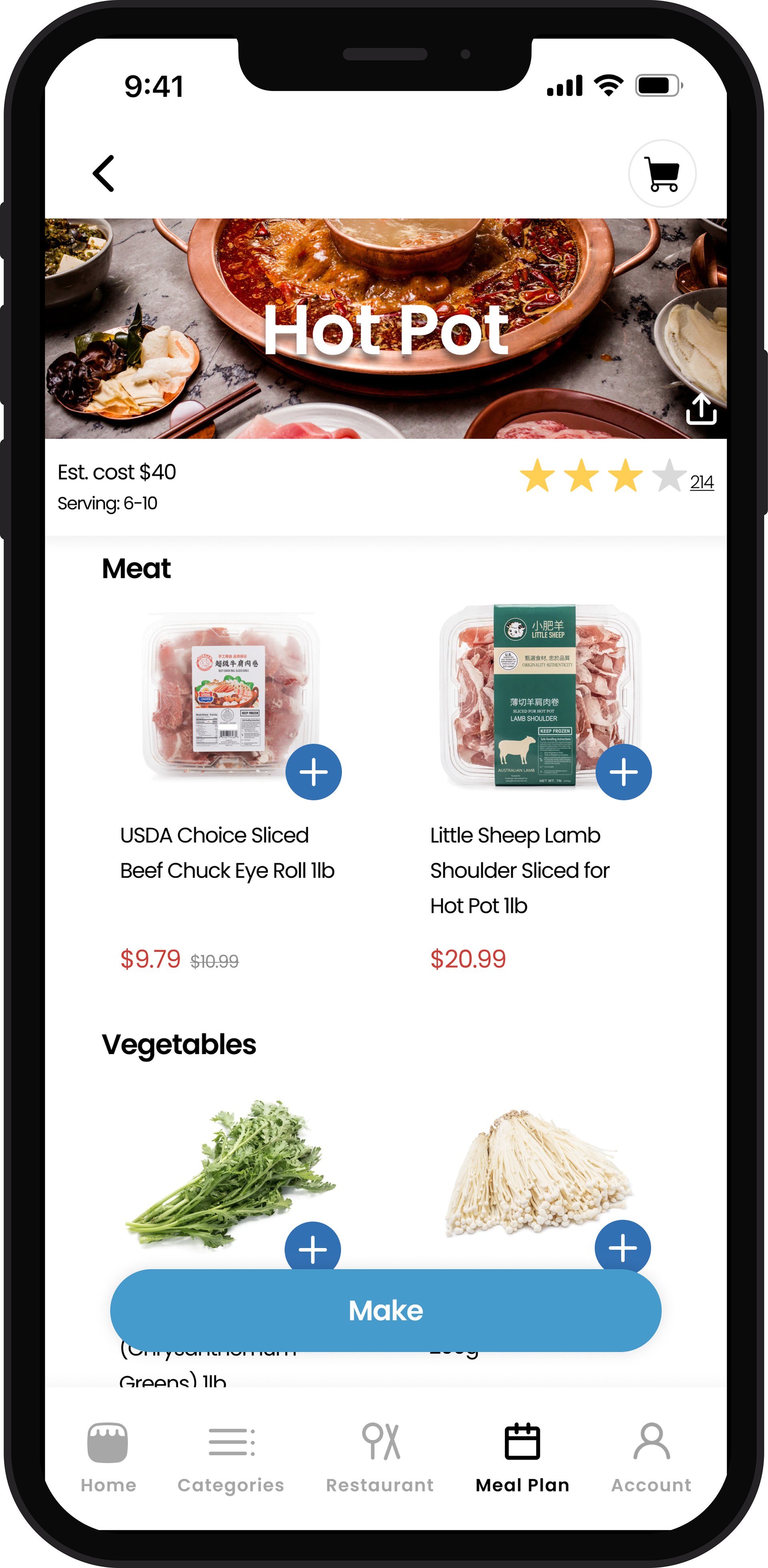
New Feature: Meal Planning
The meal plan feature adds more interest to the app and differentiates it from other grocery delivery apps. It also keeps user on the app for longer by promoting a browse/explore heavy experience. It features Asian recipes and allows users to shop based on the meal they want to make.
Weee has suggested recipes in their current app but they do not have a whole section dedicated to it nor does it have as many recipes as users would like.
Weee has suggested recipes in their current app but they do not have a whole section dedicated to it nor does it have as many recipes as users would like.
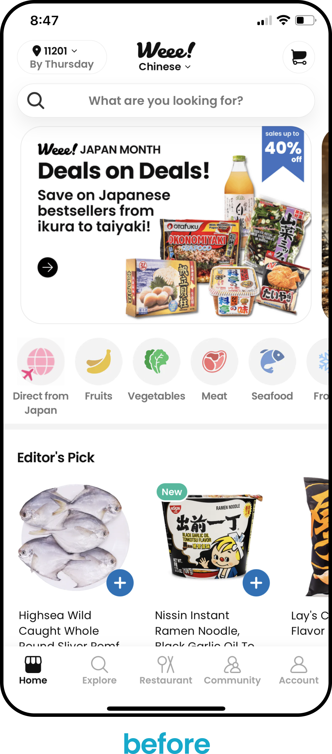
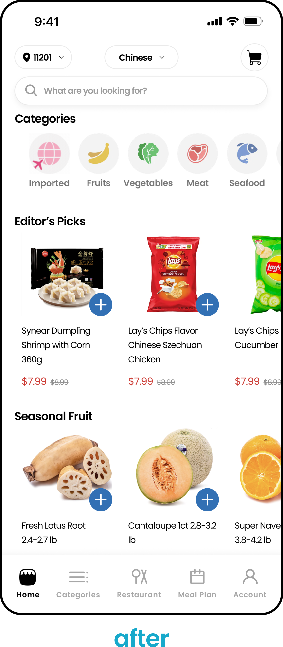
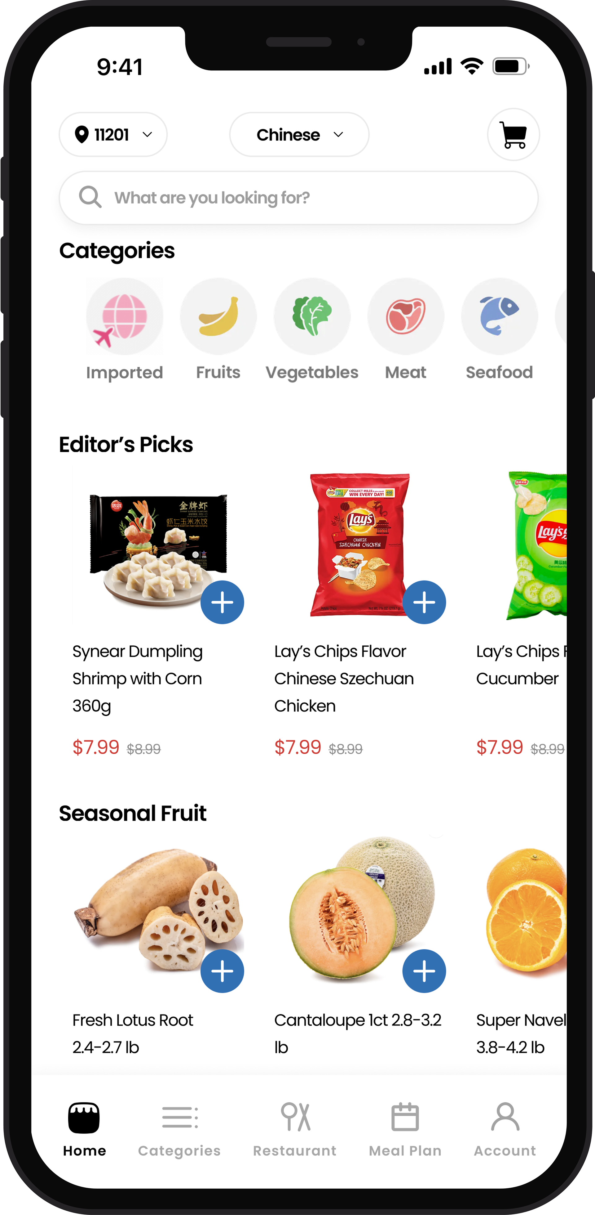
Home Page
- Removed any “ads” or suggested popups because users said they took up too much space and they hardly look at them.
- Removed any elementary UI elements, like the gray bars to separate sections and the crowded top bar, to make the page feel cleaner and look cohesive.
- Removed any elementary UI elements, like the gray bars to separate sections and the crowded top bar, to make the page feel cleaner and look cohesive.
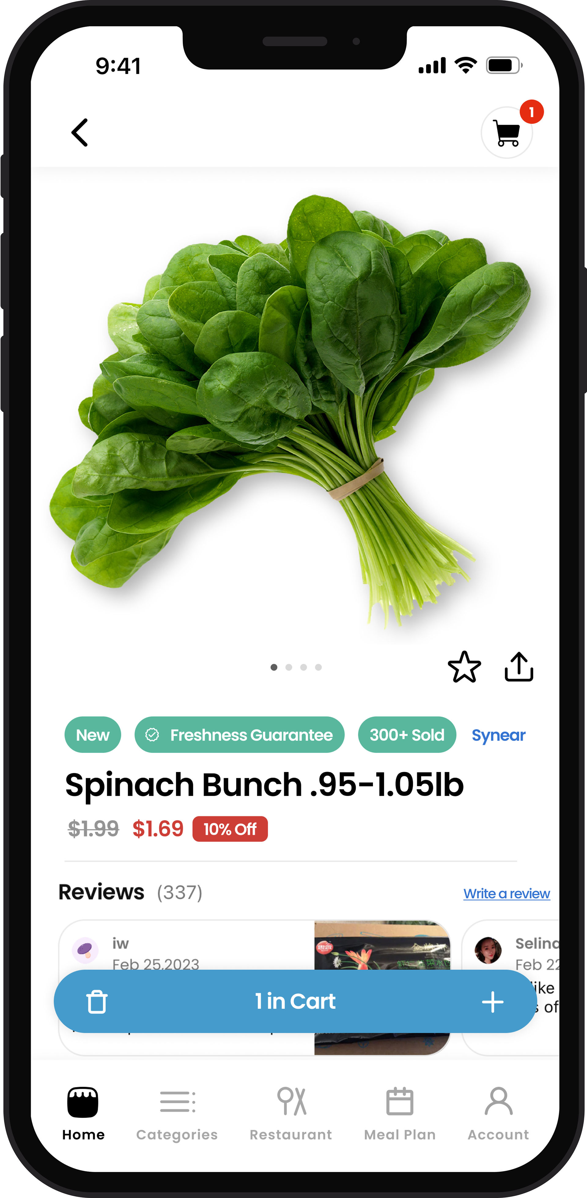
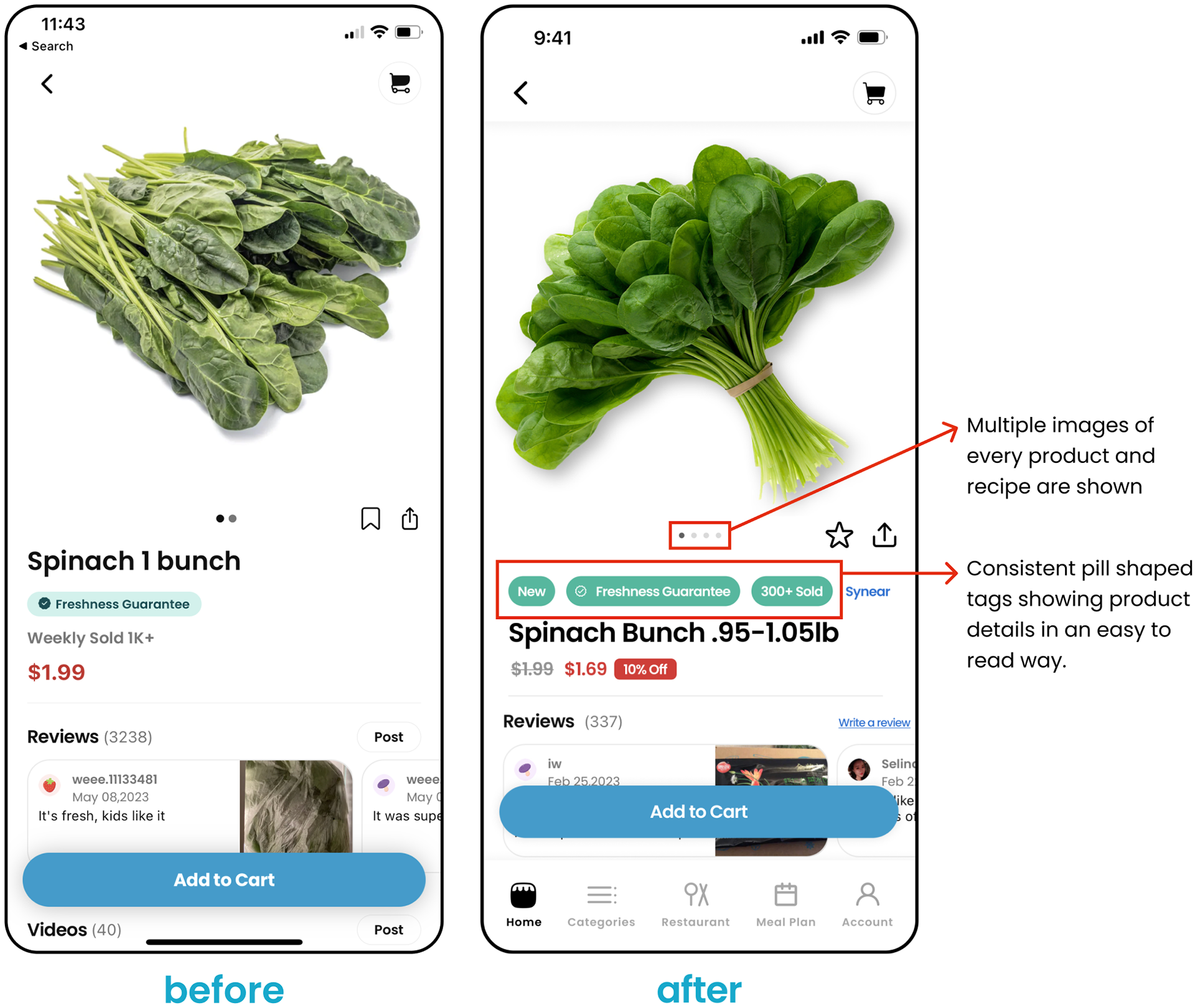
Product Detail Page
- Condensed all the product details into pills for an easily scannable experience
- Replaced the ribbon icon with a star because when grocery shopping users tend to have favorites rather than "save for later" items
- Replaced the ribbon icon with a star because when grocery shopping users tend to have favorites rather than "save for later" items
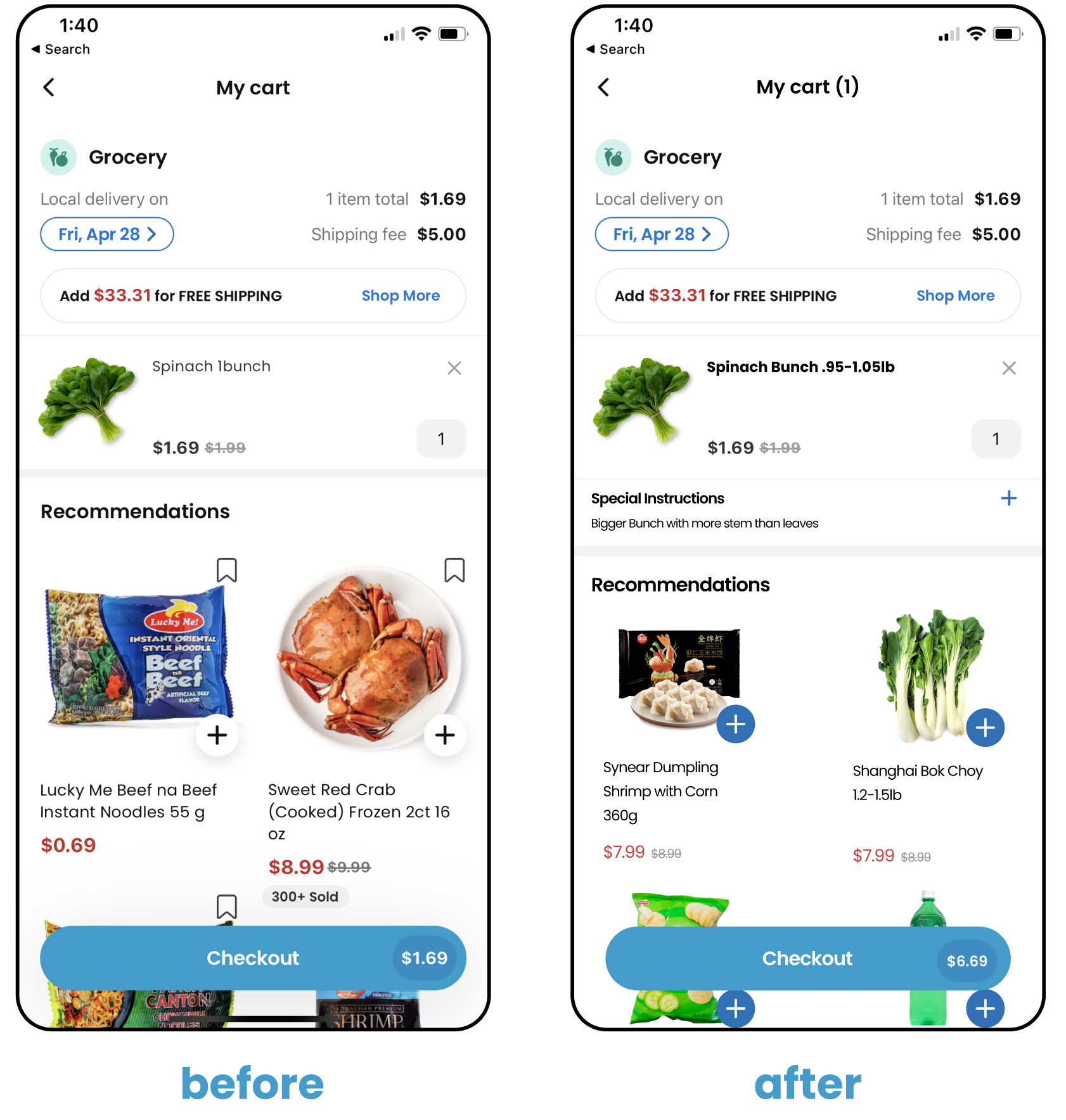
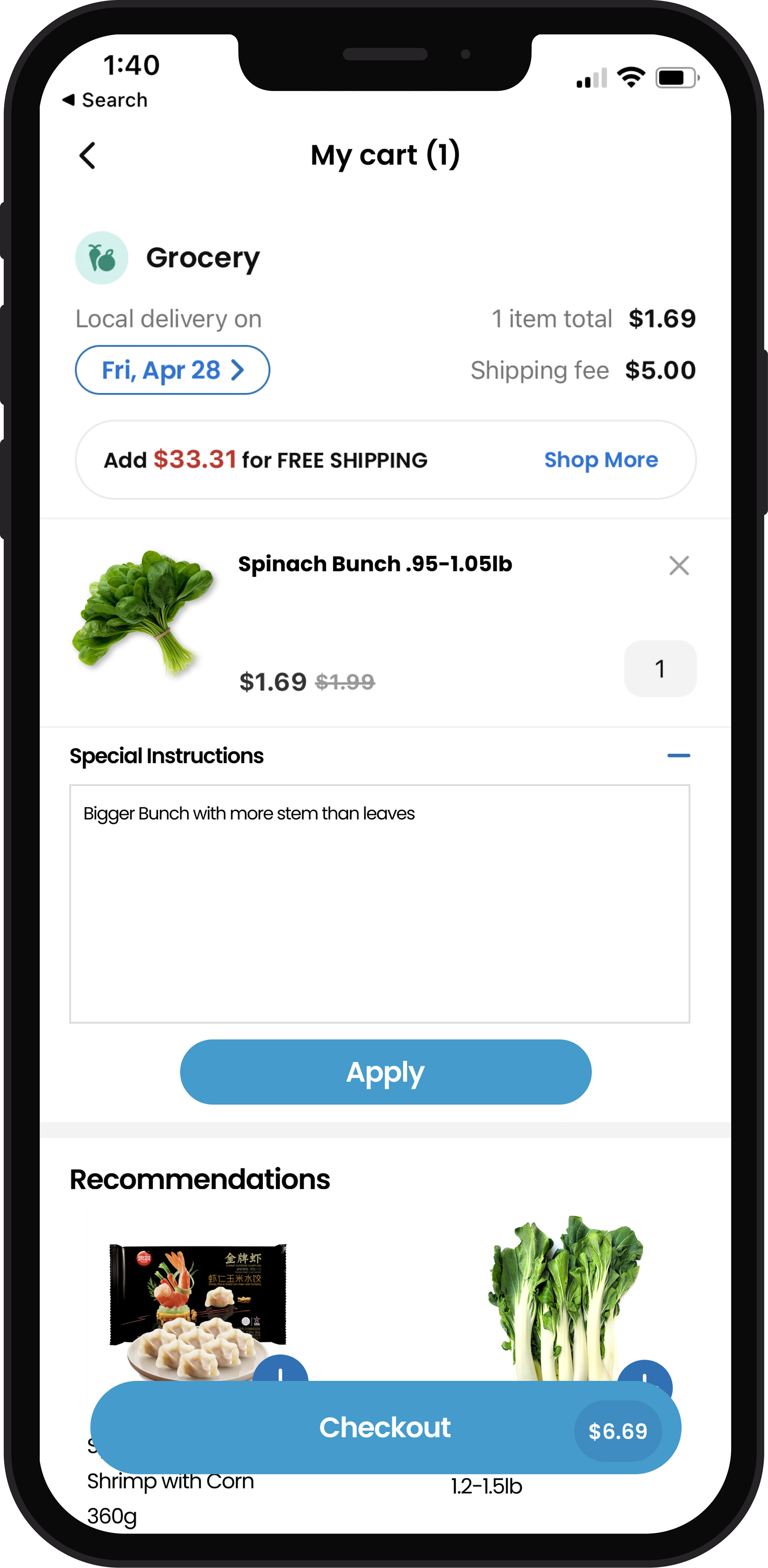
Checkout Page
- Added an input box for special instructions dedicated to each item of produce
Final Designs
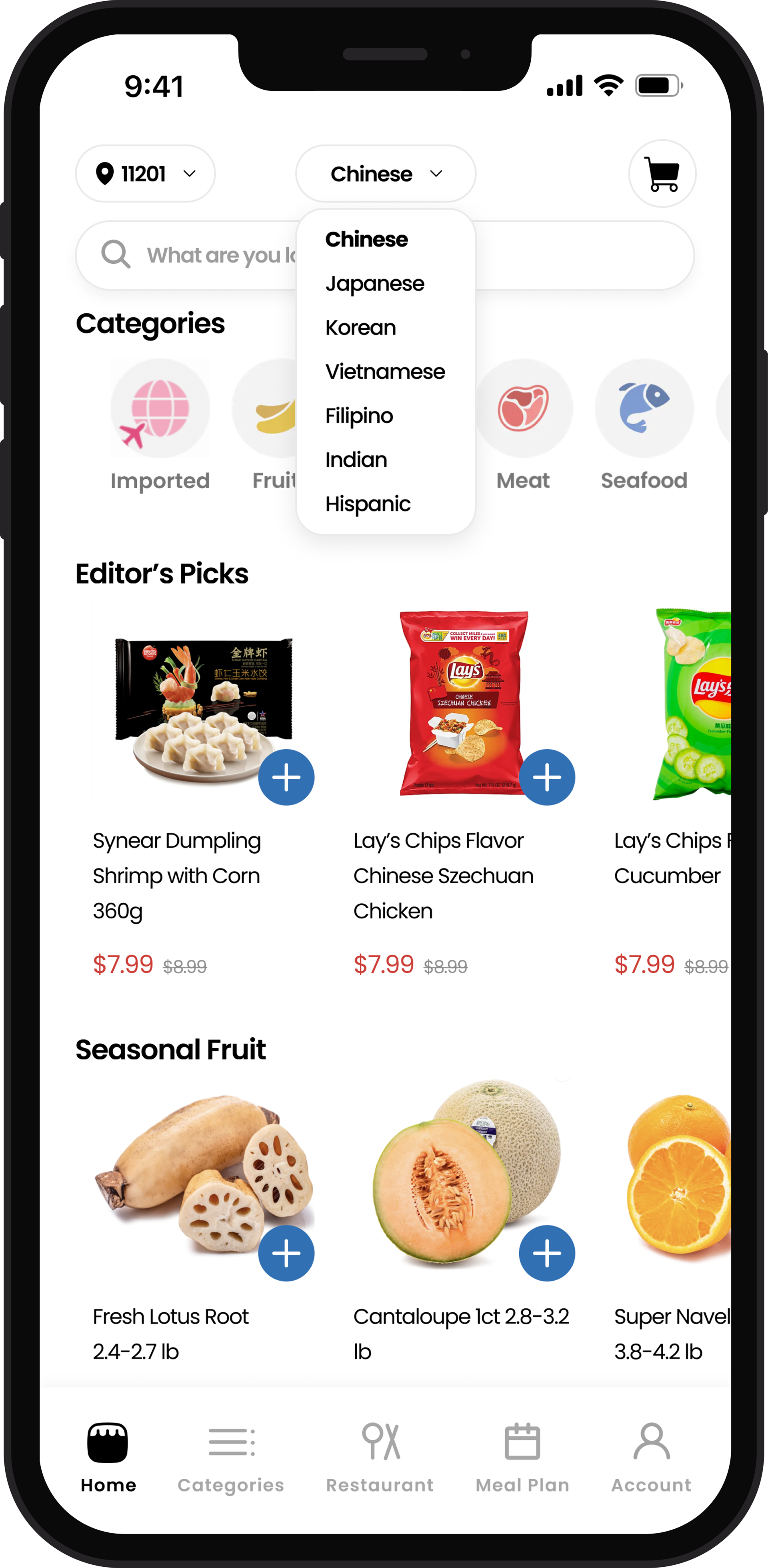
home page

product details page
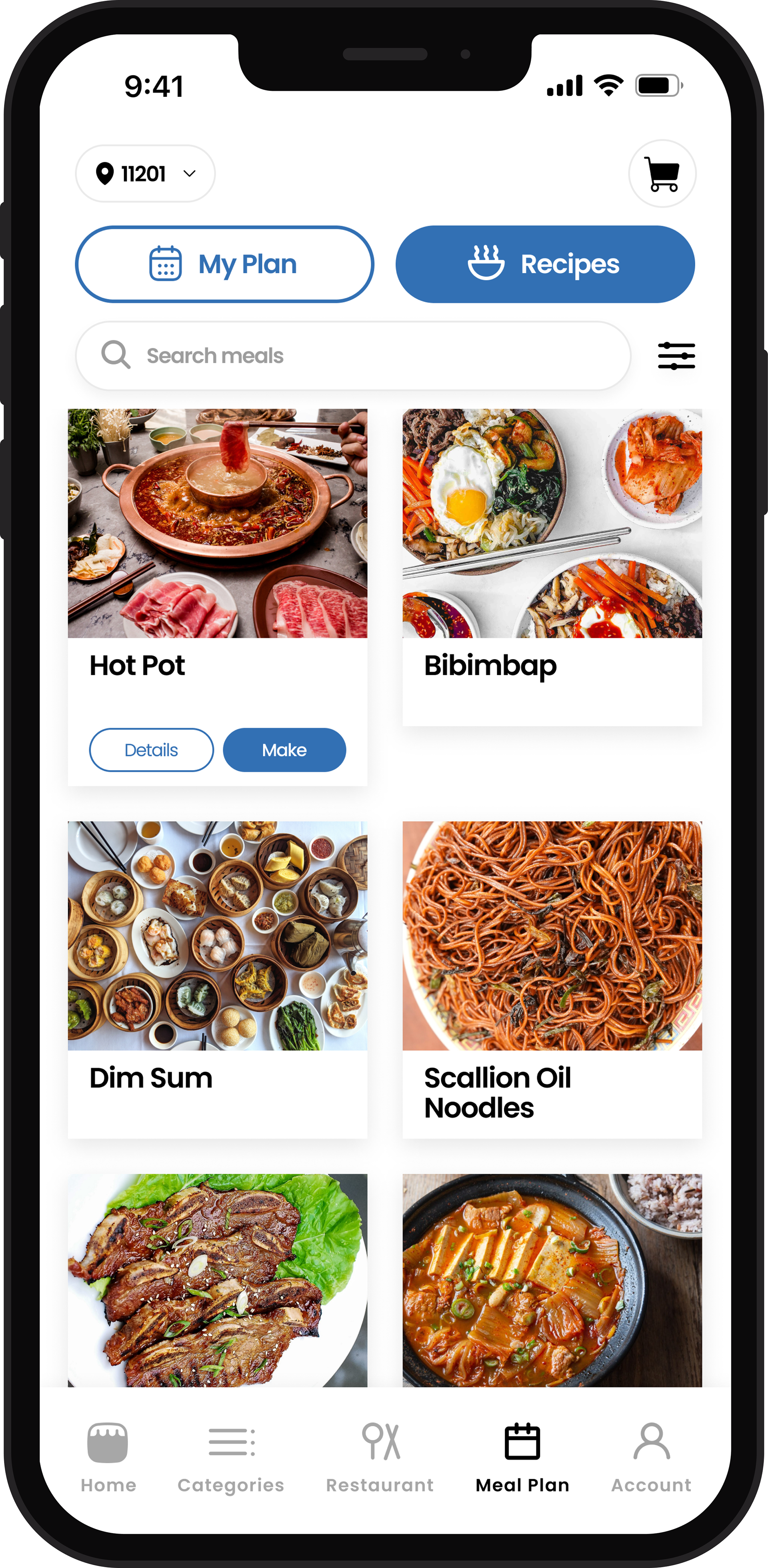
browse meal plans
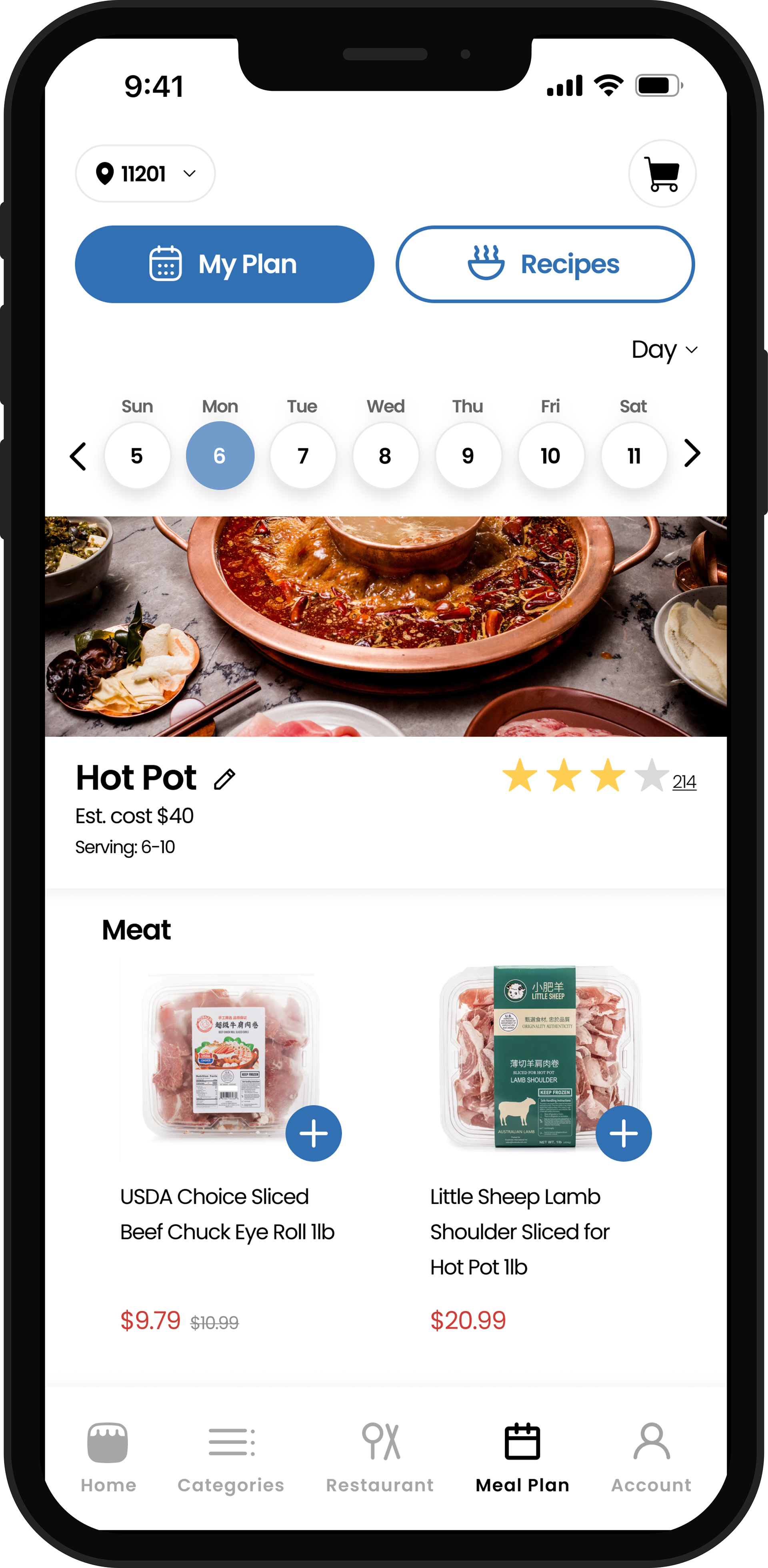
personal meal plan detail page
meal plan detail page

final prototype:
Conclusion
I chose to do this redesign project on the Weee! app because it is one I already use and love. I wanted to challenge myself to establish problems where there may not always be a problem because there is always room for improvement. This helped me learn that you can always add more even to seemingly finished products.
- flesh out the "Meal Plan" feature
- Integrate ads back into the design in a more subtle, aesthetic way
- flesh out the "Meal Plan" feature
- Integrate ads back into the design in a more subtle, aesthetic way